Mr Steven Randall Graphic Design
MCSD
United Kingdom - London
| Email address | steven@ocean-design.com |
|---|---|
| Profile description | Steven owns graphic design company ocean-design.com which he set up in 1996. His background is corporate communications and he has worked on creative projects for companies such as British Gas, Abbey National, County NatWest Ventures, Pearson and Glaxo. He set up Ocean with a view to offering smaller companies quality design at a time when they could not afford to use the large design consultancies that dominated the market. Since then he has worked for a wide variety of clients including the RIBA, PwC, British Red Cross, Regus, Elton john AIDS Foundation, Arts Council, Football Foundation and Eli Lilly. He continues to work for many membership organisations, property companies, sport associations, and charities. www.ocean-design.com |
Client comments
A selection client comments:
“We have worked with Ocean on The Big Bang UK Young Scientists & Engineers Fair for the last two years. We absolutely love working with Steven and Marianna, their ideas are brilliant and show a good understanding of our brand and our objectives. This year’s ‘instagram’ theme has been extremely popular amongst our target audience of young people, their teachers and parents; and the flexibility of the design has allowed us to use it on more materials than initially planned. The marketing campaign for The Fair has many elements to it; some have long lead times and others will be last minute additions that need to be turned around quickly. In all cases Ocean deal with the project in a calm, professional manner and deliver great results on time and on budget. We would definitely recommend working with Ocean; they are a delight to work with.”
Marketing Communications Executive, EngineeringUK
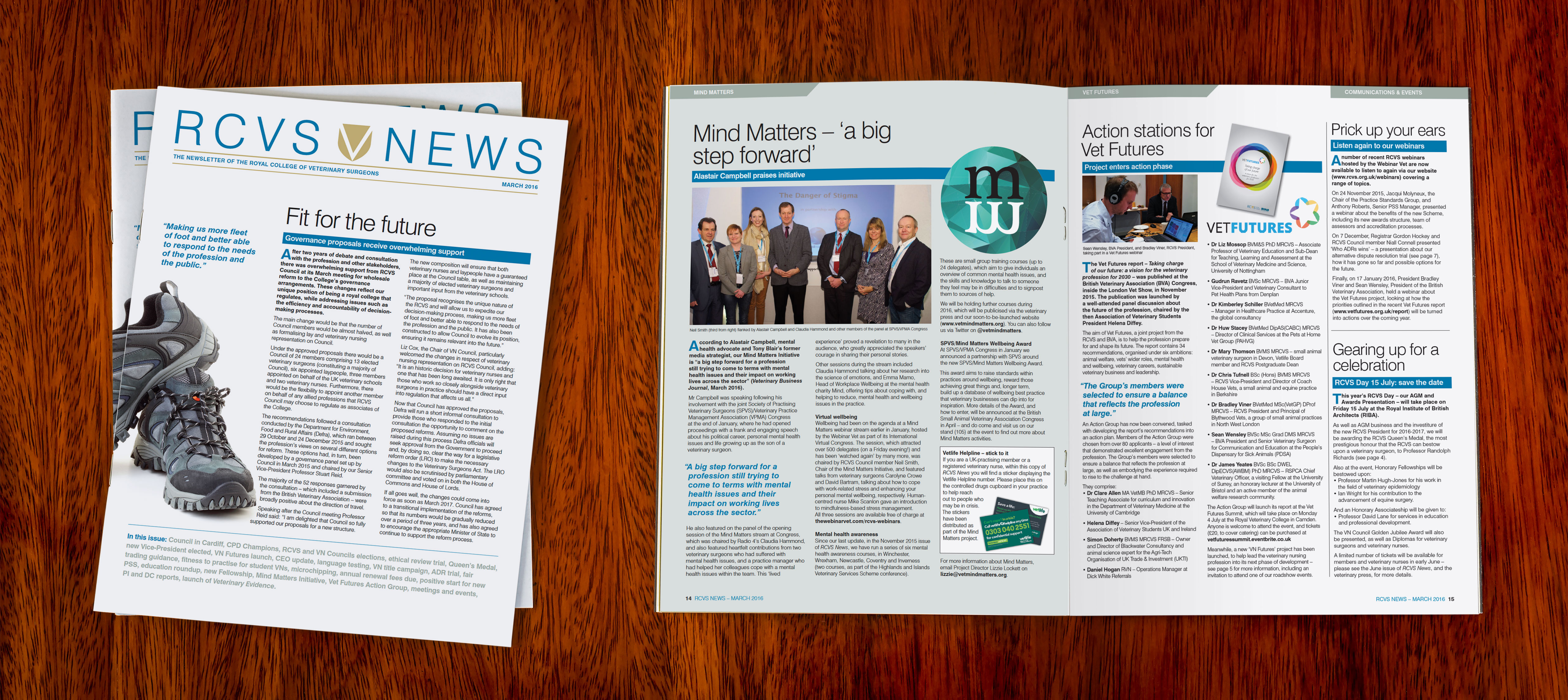
Chief Executive Officer, RCVS
Marketing, Marcomms & Business Development, Indigo Planning
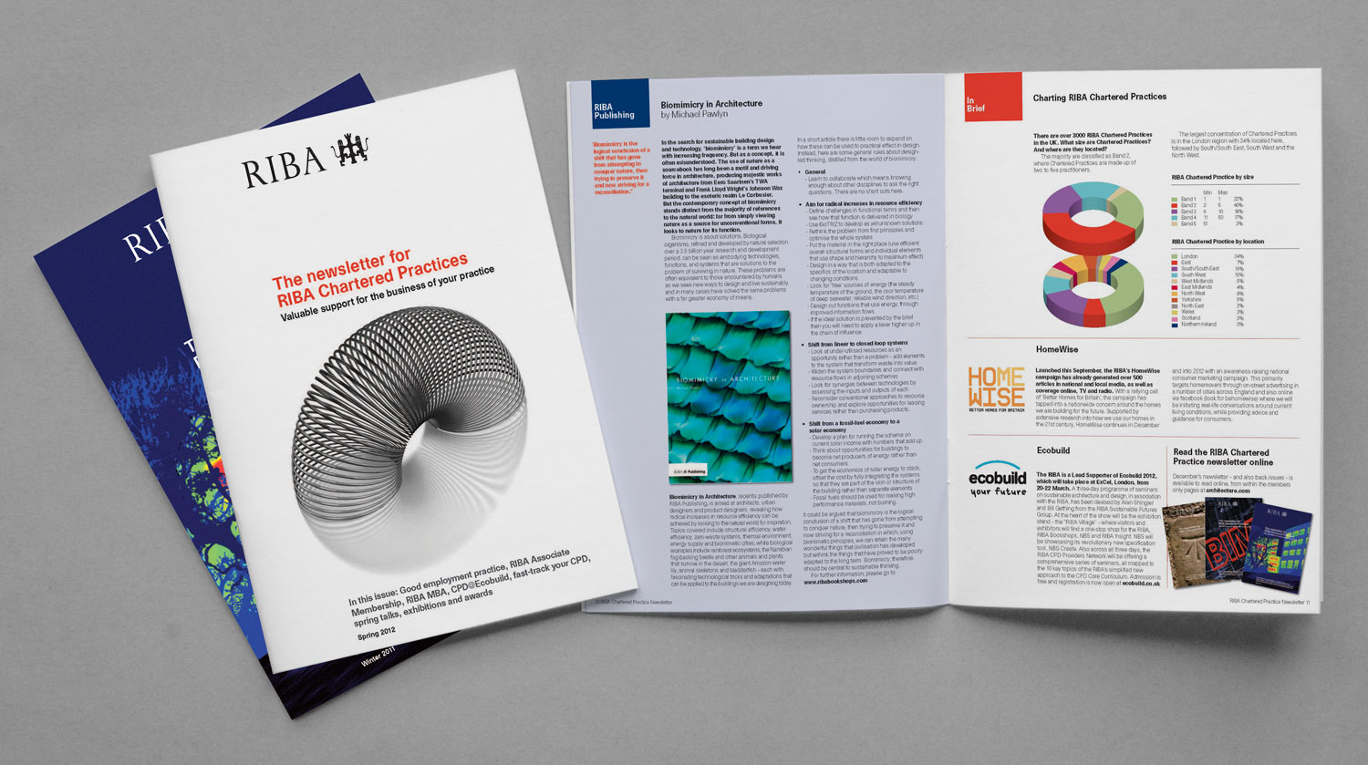
Marketing Executive, RIBA
Communications and Digital Content Officer, Chartered Association of Business Schools
Group Marketing Director
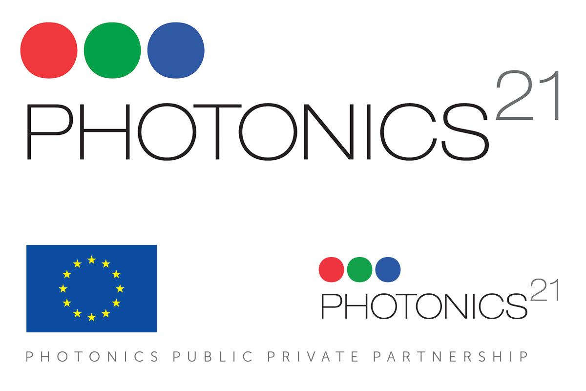
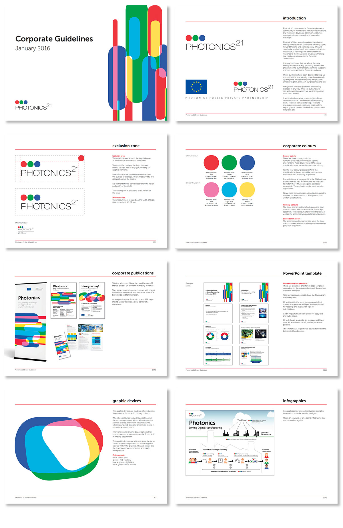
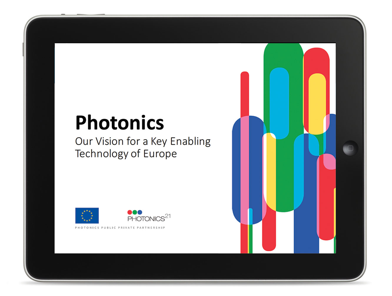
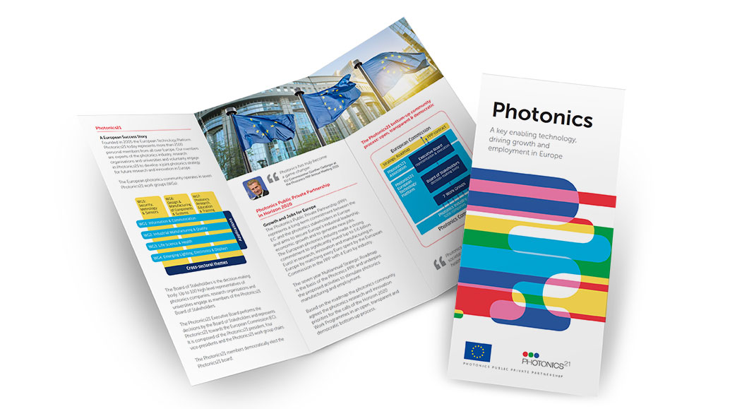
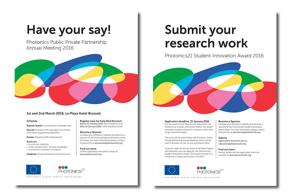
Photonics21 – Brand refresh
The European Technology Platform Photonics21 represents the European photonics community of industry and research organisations.
They were invited to form a Photonics Public Private Partnership back in 2012 with the European Technology Platform (ETP) representing the European Photonics Community.
At the beginning of 2015 they decided that they needed to update their brand identity which was starting to look a little dated and disparate (as examples here show). At the same time they needed to create an extension of their brand which could incorporate the Photonics Public Private Partnership.
We updated their existing logo by making it less elongated so that it could gave more impact when displayed alongside other logos. We also adjusted some of the letter spacing so that it looked more uniform.
At the same time we created the PPP logo using strict European Commission guidelines.
We also created a new set of visuals based on ‘light’ and the mixing of the three primary colours.
A number of design templates have been created to reflect three key areas of Information, Events and Brochures. The striking visuals will give standout and unity and are a big departure from all previous work where slightly clichéd stock images of people, light waves and technology were used.
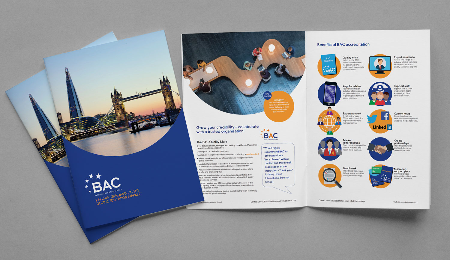
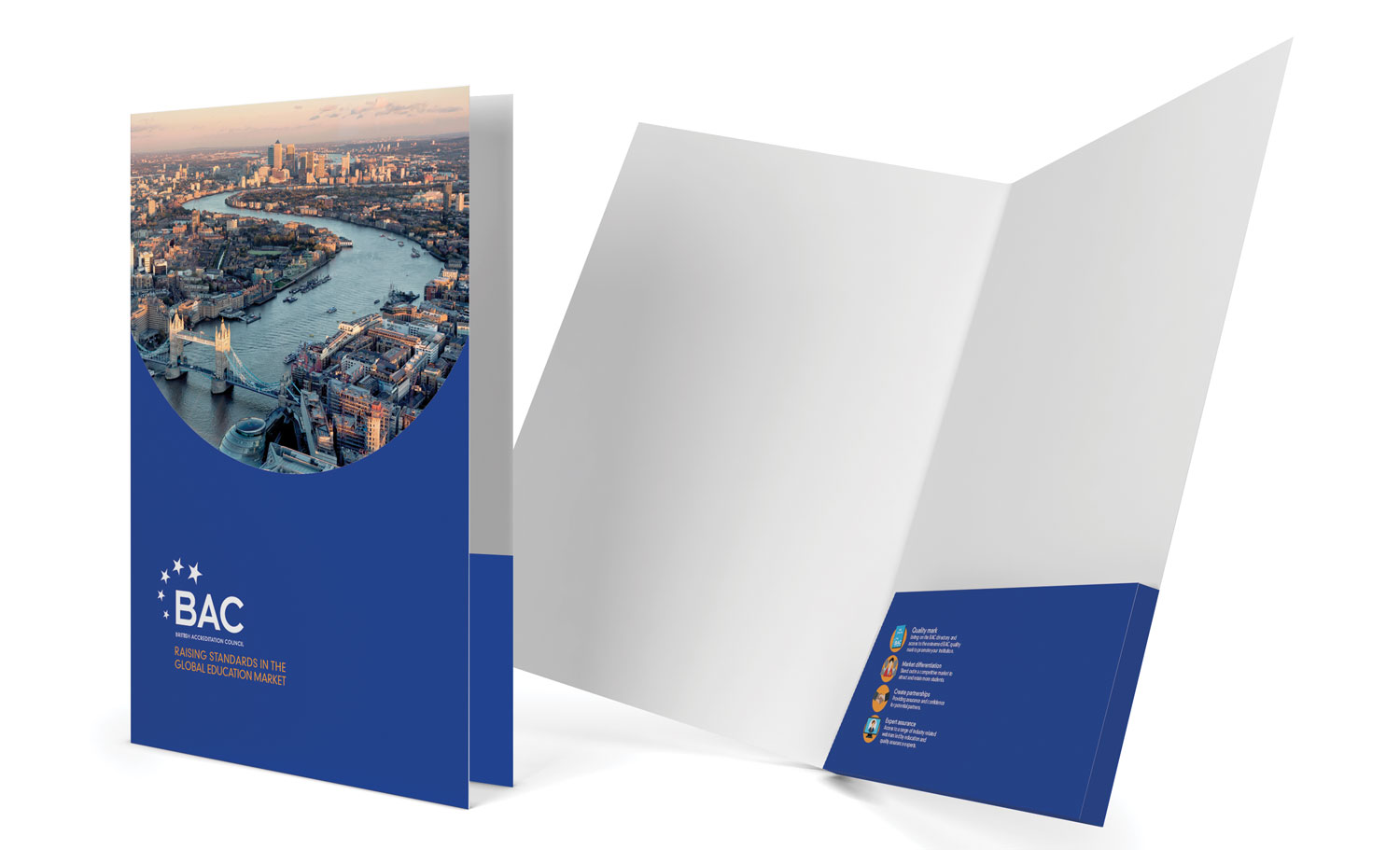
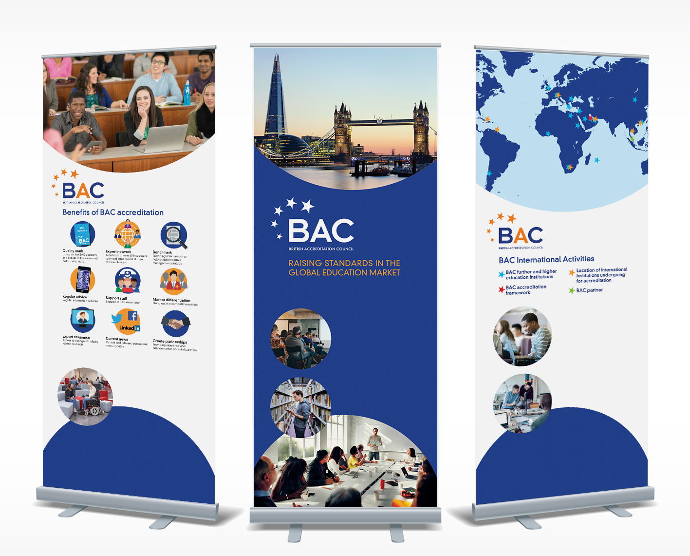
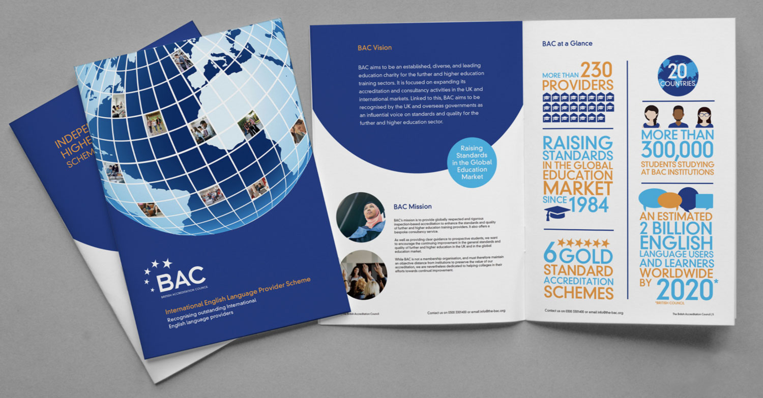
British Accreditation Council – Marketing communications
The BAC are responsible for setting standards within the independent further and higher education sector. Their accreditation is held by hundreds of colleges and training providers in the UK and overseas.
Ocean designed and created their new flagship corporate brochure to act as an aid in marketing the advantages of membership. A set of infographics highlighting BAC benefits as well as a set of fact and BAC value graphics were created and used collectively within the brochure but could also be individually for social media and online promotion.
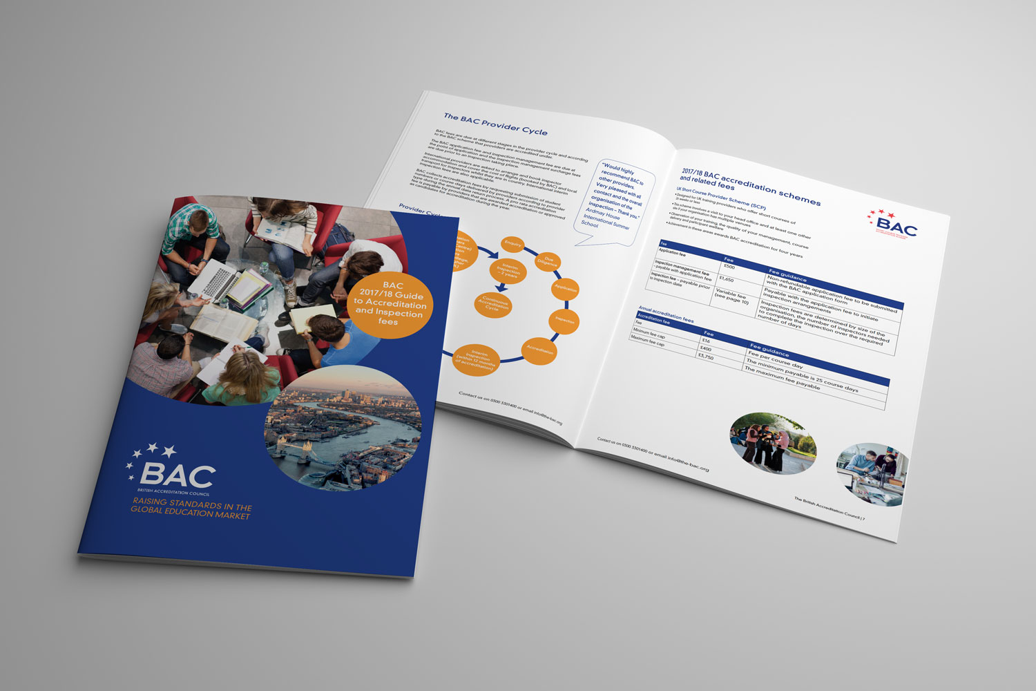
Following the design style for the Corporate Brochure, the BAC Fees document, which is a hard-working marketing tool, helps to
highlight the costs involved for global education establishments when applying for the BAC accreditation. Ocean designed this within the same style as the corporate brochure to help unify the brand identity across all marketing material.
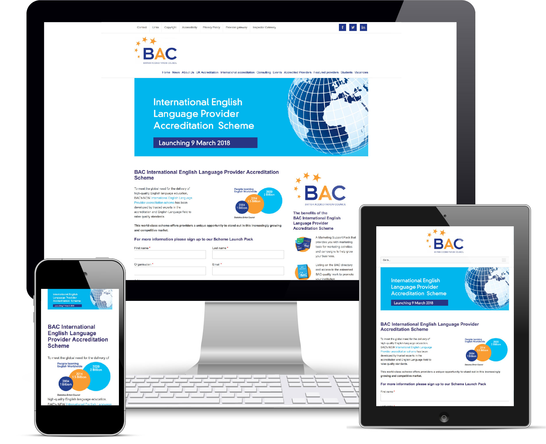
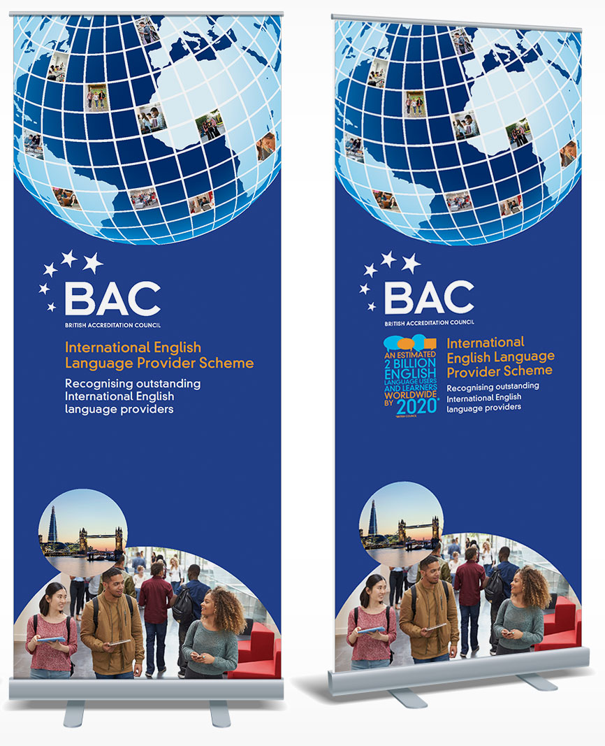
In March 2018, the BAC launched their new ground-breaking IELP scheme at the House of Lords. This world-class scheme offers providers a unique opportunity to stand out in an increasingly growing and competitive market and help raise the standards and quality of teaching on offer to prospective new students.
The design for all the launch material was kept in line with previous BAC work but the use of the ‘global’ look and feel gives the IELP it’s own distinctive identity and sets it apart from the other BAC branded material.
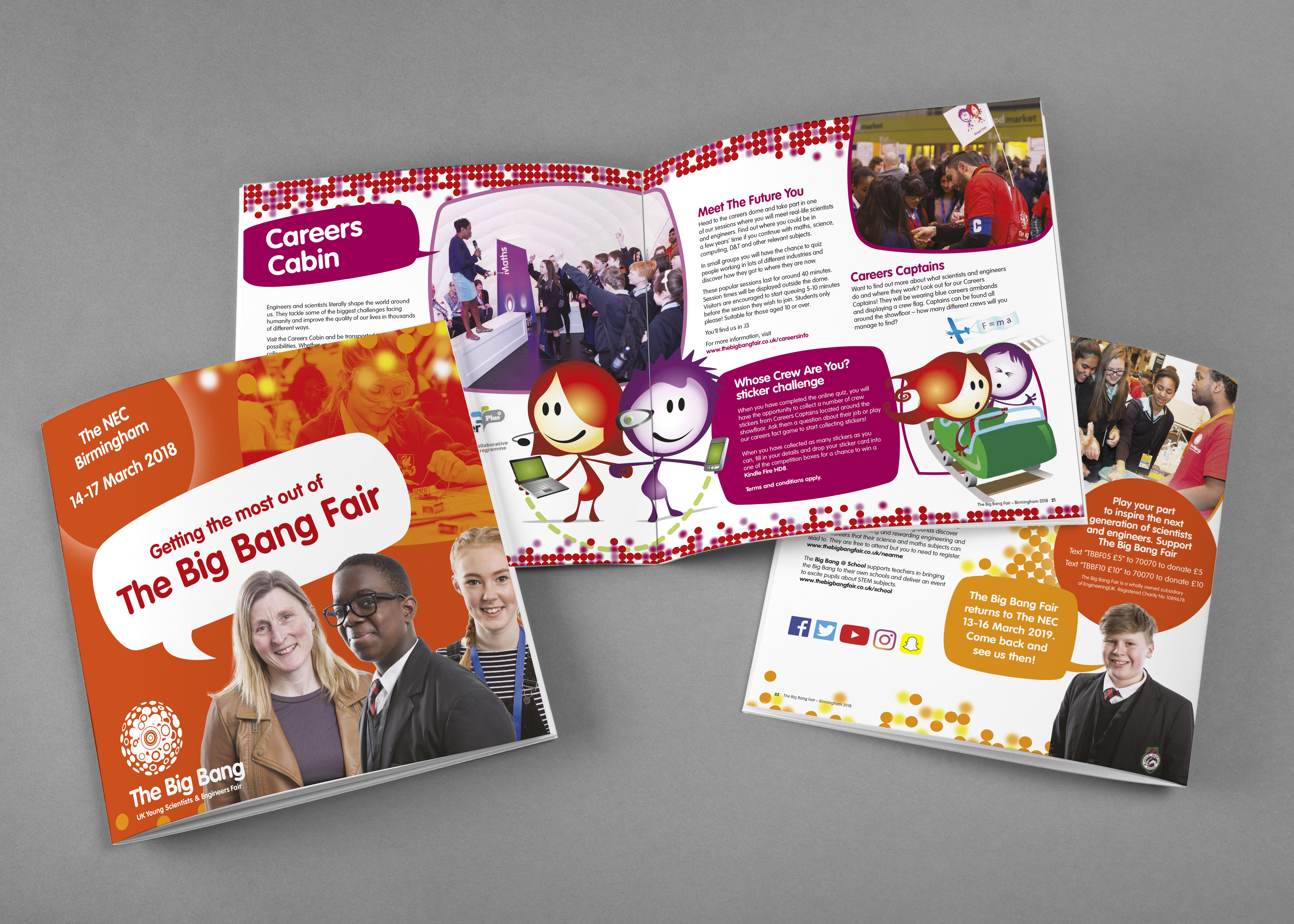
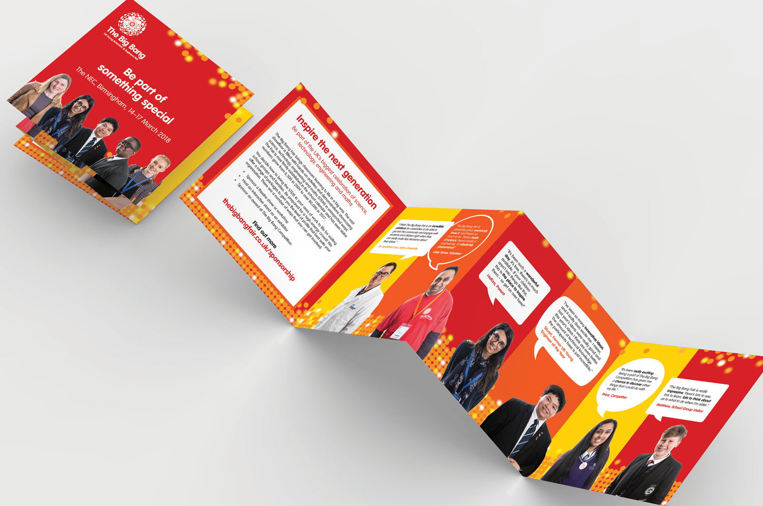
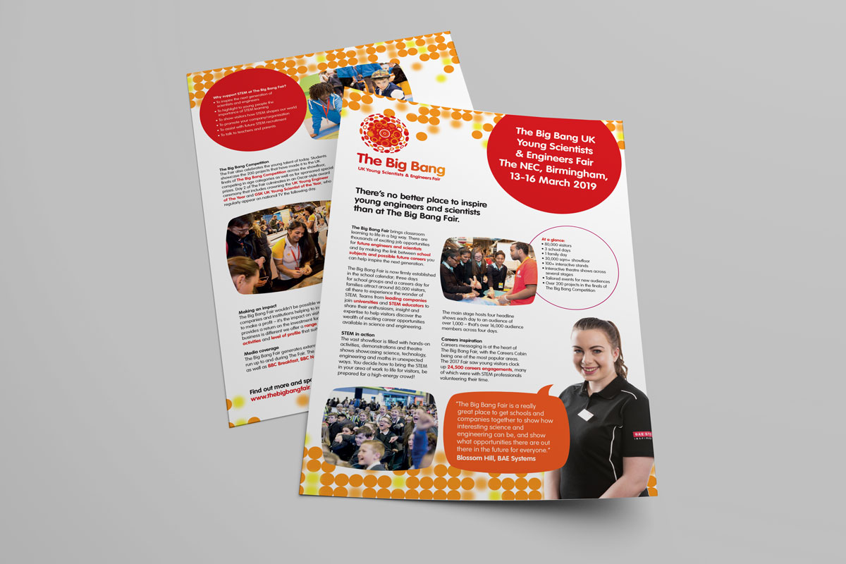
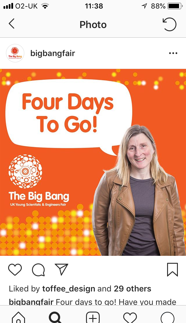
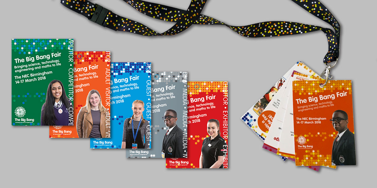
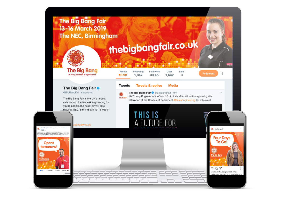
Big Bang Fair – Event branding
The Big Bang Fair, organised by Engineering UK, is the largest event which celebrates science, technology, engineering and maths for young people. It offers an exciting ‘hands on’ approach to show the audience just how exciting and rewarding job opportunities there are for people with the right experience and qualifications.
Ocean has worked with Engineering UK since 2012 on this project each year providing an engaging theme that would help bring to life The Big Bang brand and its yearly fair. For the 10th anniversary 2018 event, Ocean created a theme based on VIPs and ‘heros’ of the Big Bang Fair to highlight all the various people who make the fair such a big success from teachers and sponsors to all the budding young scientists that take part.
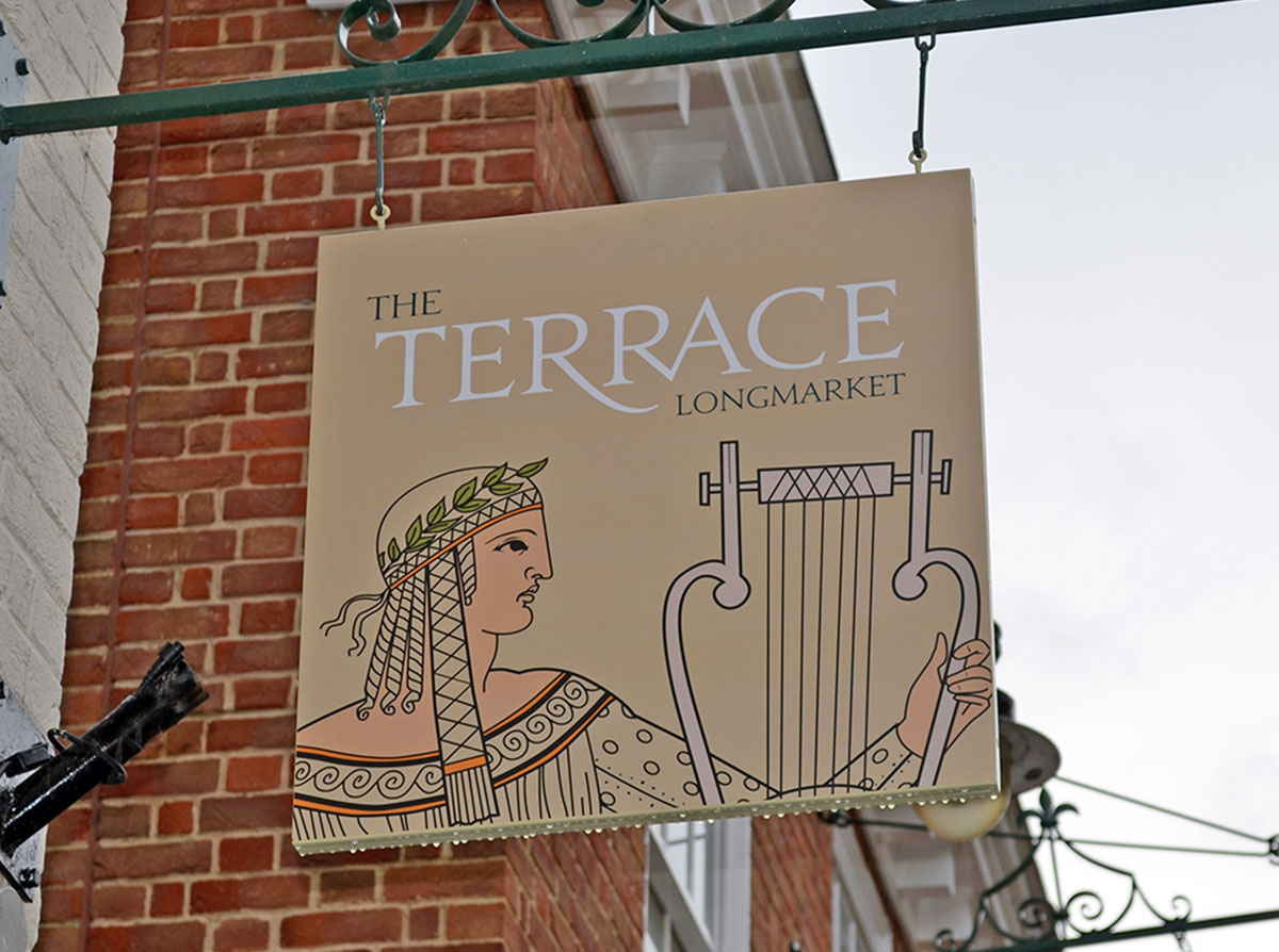
Longmarket, Canterbury – Way finding
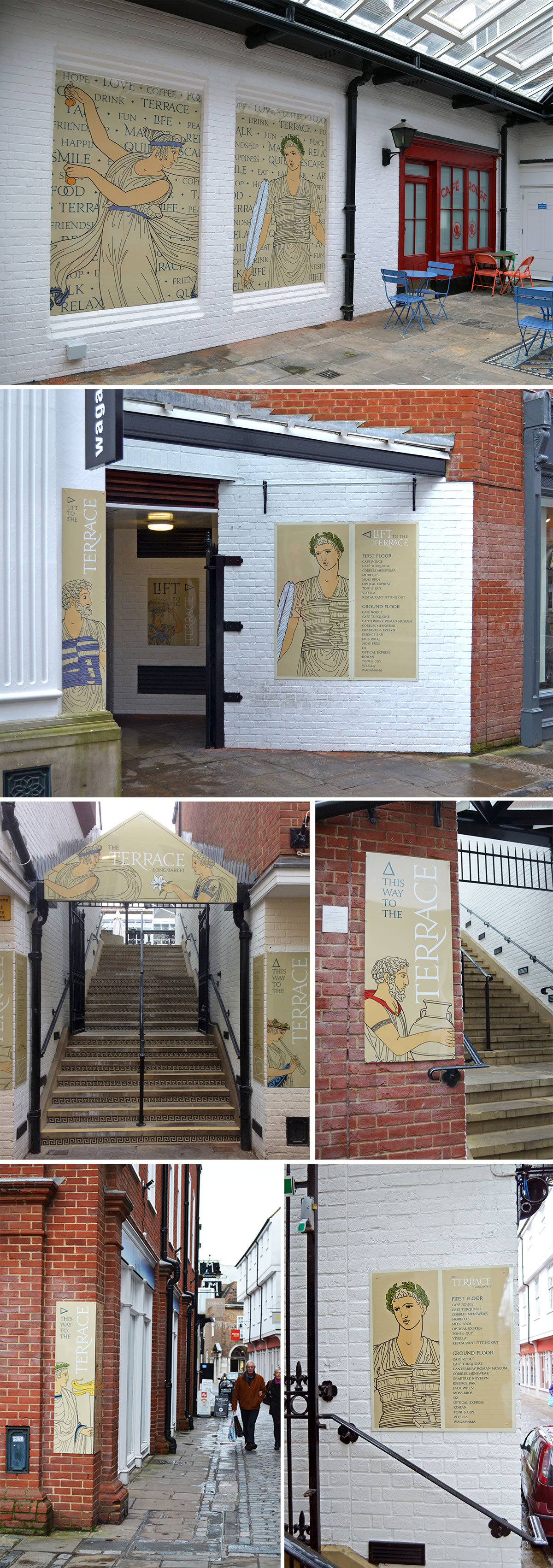
DTZ, now part of the Cushman & Wakefield brand, approached Ocean to ask if we could create a wayfinding solution to The Terrace, Longmarket, a shopping area within Canterbury city centre. The site consists of a pavement shopping area and a cafe terrace level above which is approached by a set of stairs at either side of the site. The present signage was very old, unattractive and said nothing about the retail experience. Because of this footfall to the terrace area was very small.
DTZ set the task to make this area more prominent to encourage more footfall onto the terrace area as the client was developing more retail and cafe space there. At the same time make the whole location a desirable place to shop, meet and relax. A new wayfinding solution was needed that was visually eye catching and created more emotion and warmth which would help this goal become achievable.
Our solution was to produce a theme that would convey emotion, desire and warmth to answer the client objectives. We drew inspiration from three areas and presented them as mood boards. One based on ancient roman life because in the basement of the site is a small museum centred around an ancient town house with mosaics. The second option was themed around a secret garden because the terrace area is quite hidden and we thought that we could create a hidden garden wit signs tempting people up there. The final idea was all about love and wishes which was inspired by hidden notes and love tokens.
The ‘roman life’ theme was chosen. We then developed it in a number of ways before agreeing a figurative solution. We commissioned an illustrator to draw up a set of ‘roman’ characters that we were able to adapt and colour up so that we could create a set of final designs for all the different locations.
The result is an attractive, unified set of wayfinding, gateway, information and goal signage that adds a positive and colourful addition to the surrounding shopping area.
We are also pleased to report that footfall to the terrace area has increased since they were installed.
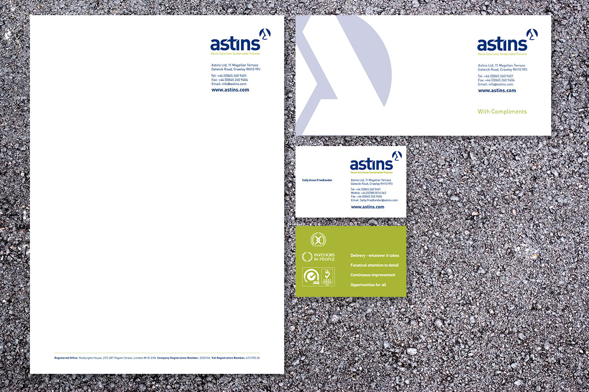
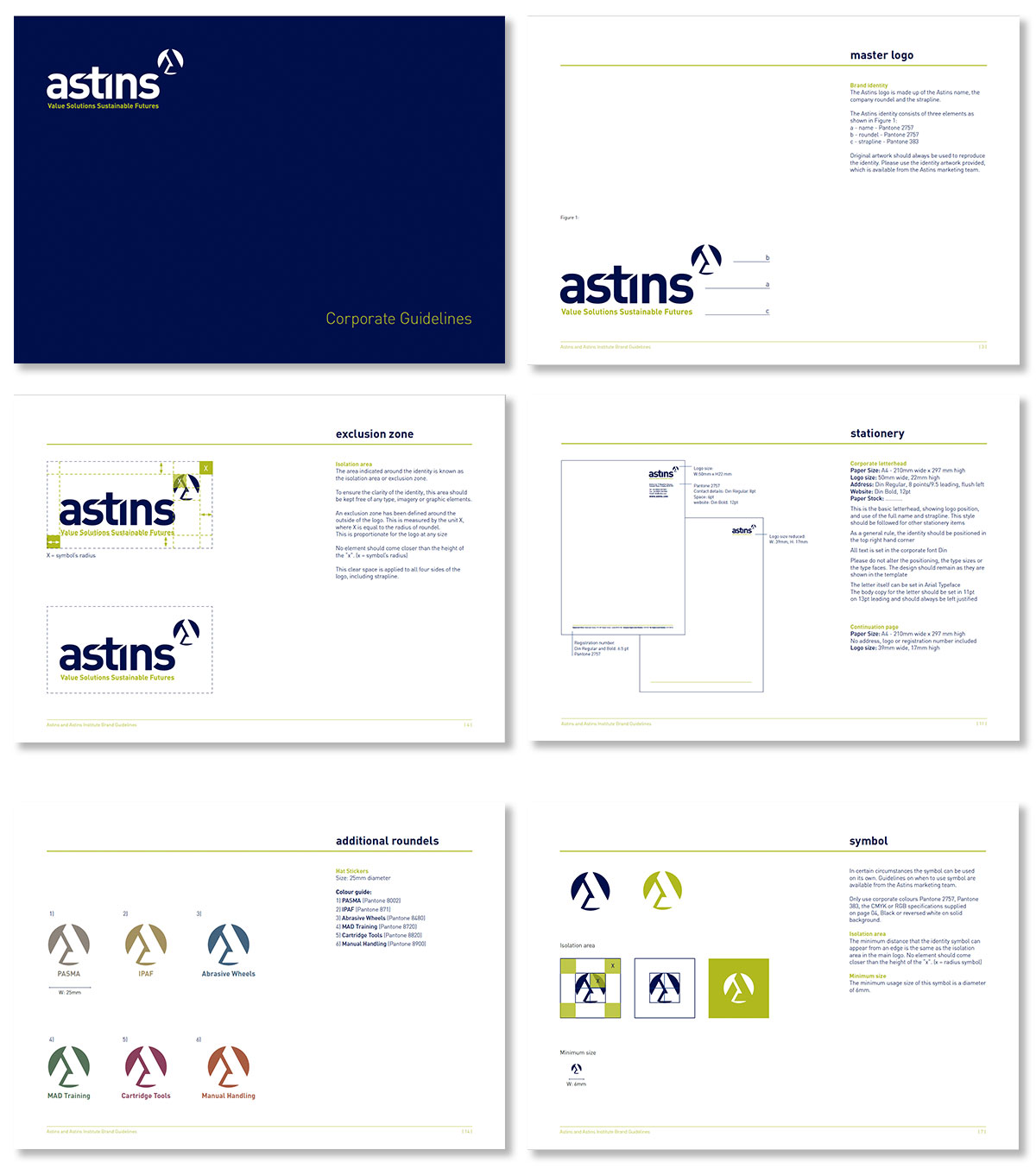
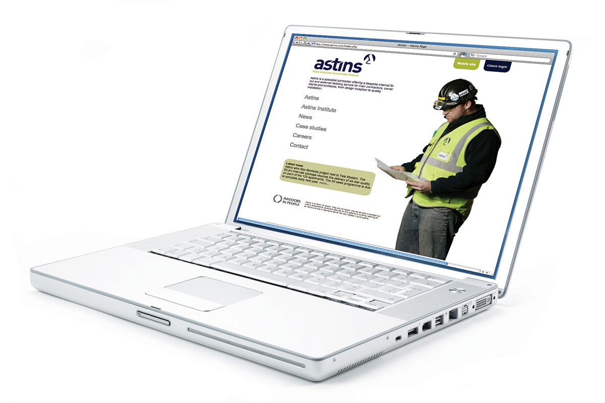
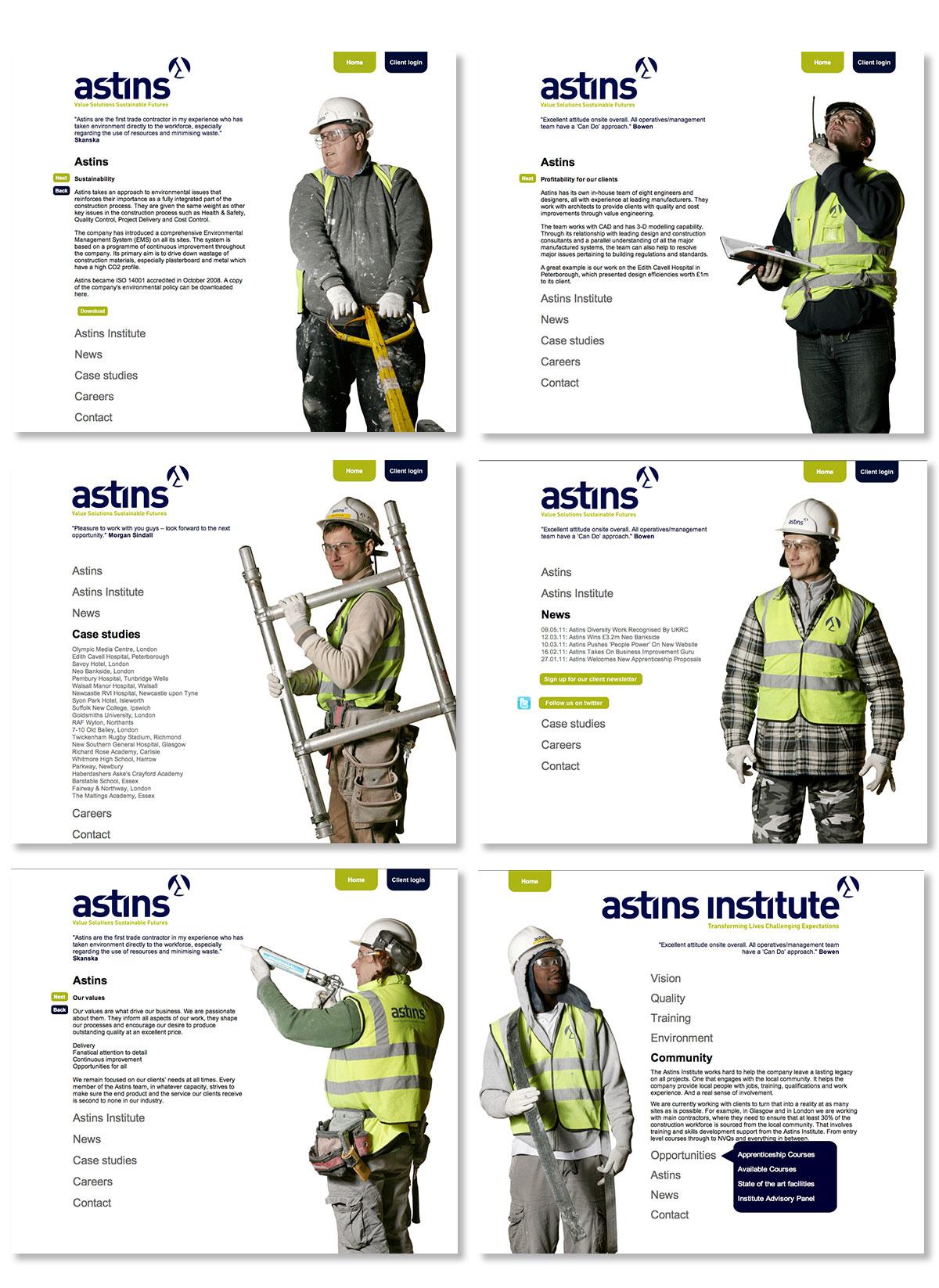
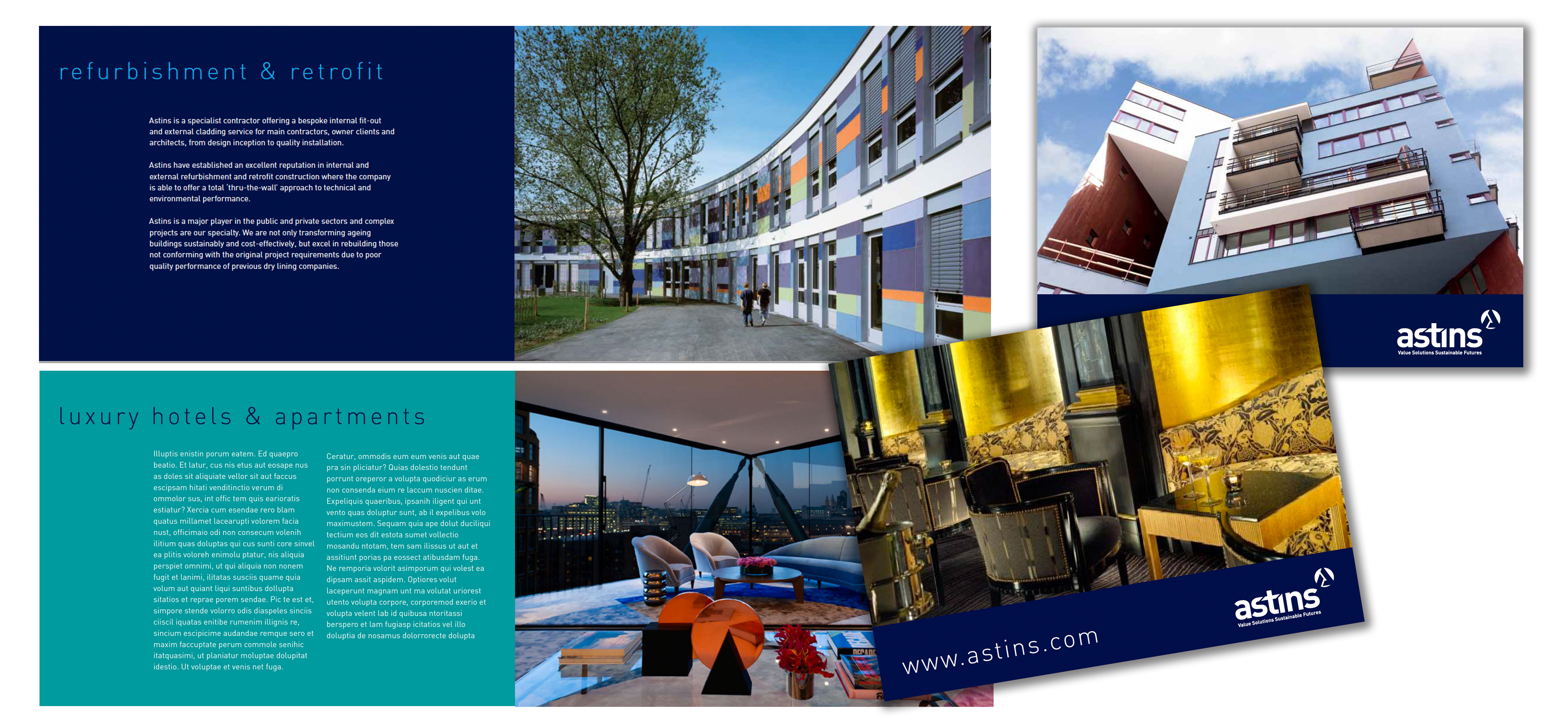
Astins – Brand Identity
Astins is a specialist contractor offering a bespoke internal fit-out and external cladding service for main contractors, owner clients and architects, from design inception to quality installation.
This is a complete rebrand consisting of new logo, identity guidelines, corporate stationery, website, literature both printed and digital plus a templated excel spreadsheet tender document.
The website used real members of the Astins workforce to reinforce the notion that they are committed to their employees with an ethos of building a trusted ‘family’ workforce.
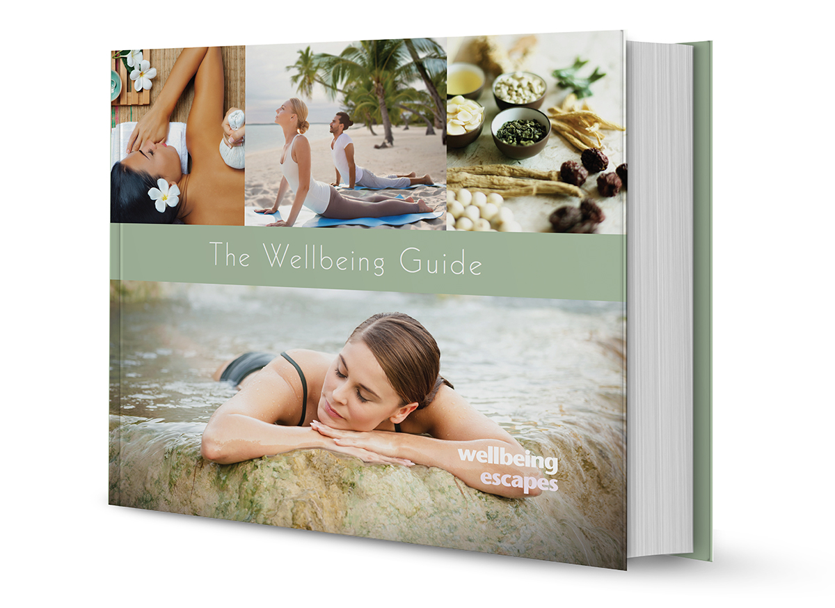
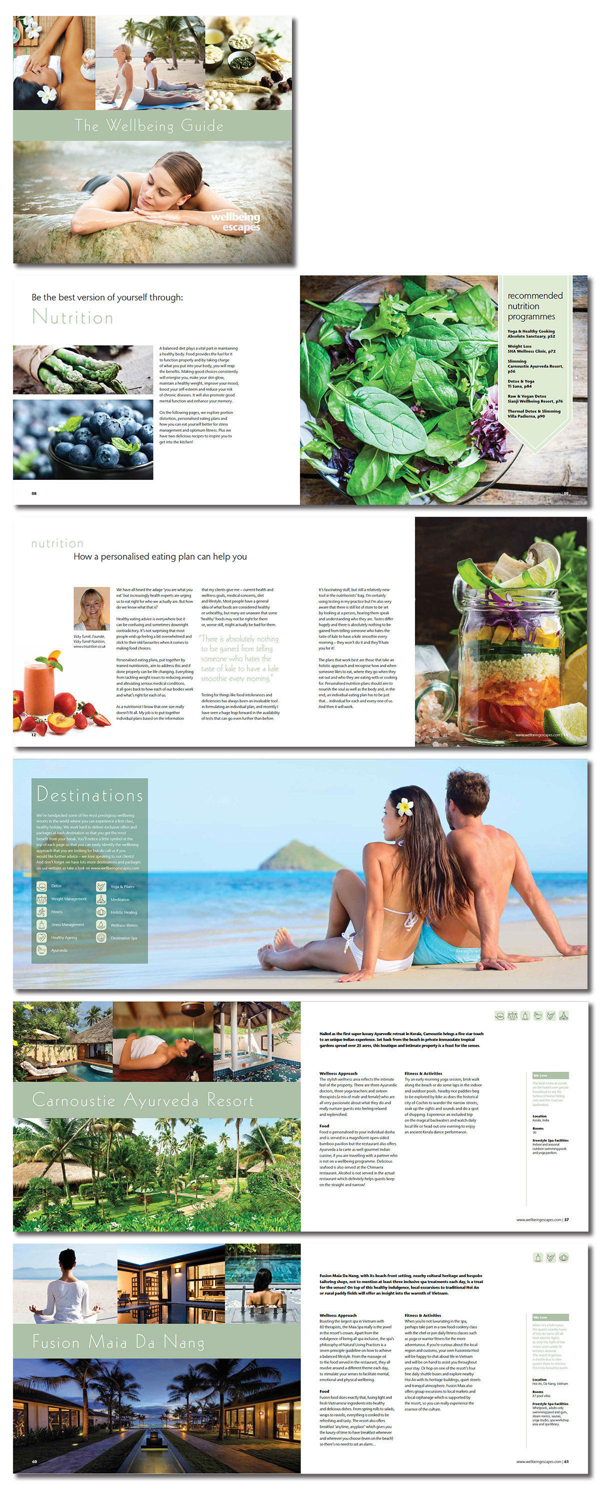
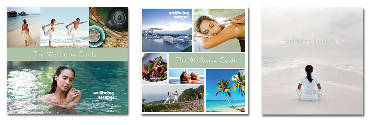
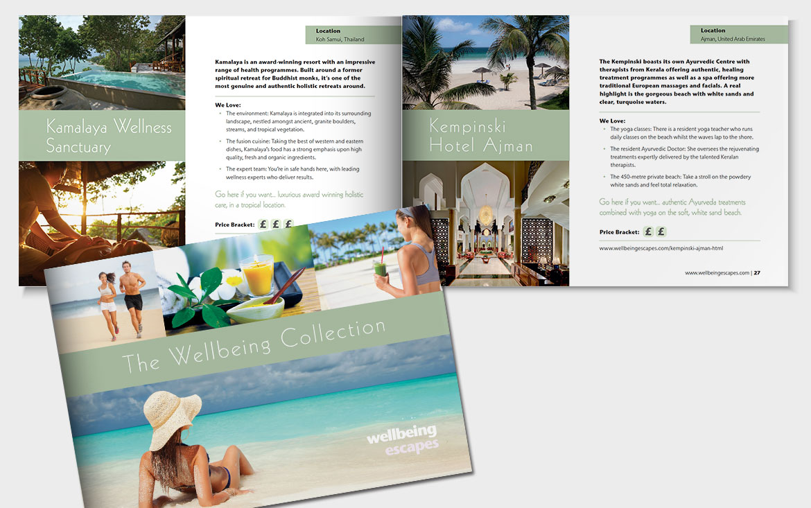
Wellbeing Escapes – Luxury travel 'lifestyle' branding
A major player in the online luxury travel market, wellbeingescapes.co.uk is all about helping customers find the best health and lifestyle spa choices to suit their needs.
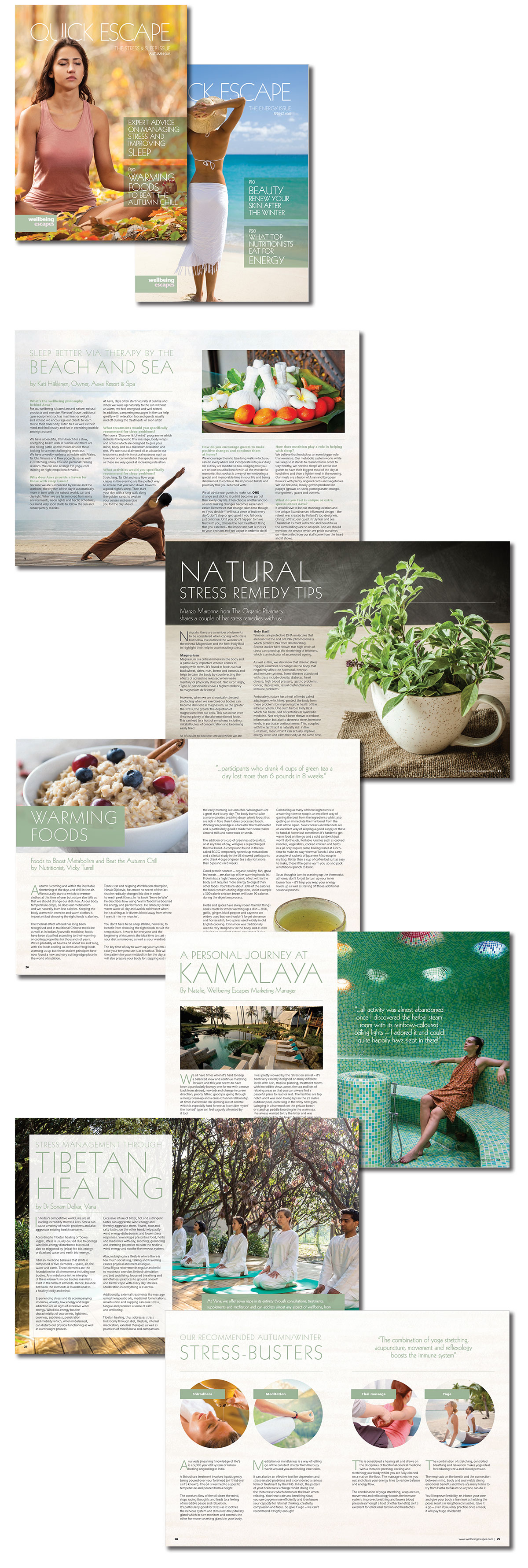
We have designed four books for Wellbeing Escapes, the fourth edition of this beautiful 104 page, case bound book, designed to reinforce the Wellbeing brand and raise their profile. It was given to the company’s most loyal customers as a thank you. As the previous editions, this too oozes indulgence, luxury but retains an essence of purity with the fresh, clean, clear approach. Each section opens with an enticing image in preparation for the delights ahead. The Destinations section transports the reader to each stunning location with ravishing imagery, an irresistible resort description, a simply designed wellness approach key, at-a-glance facts, insider tips and Wellbeing’s own personal ‘we love’ message. The book has also been designed to work hard for its money as it contains a wealth of information, quality advice and interviews with leading experts in a wide variety of spa and health treatments plus, a whole section on pre and post spa tips, all beautifully laid out. We like to think of it as a spa lovers bible. It has high design and production values so that it would be something people would be happy to keep, share with friends or display on their coffee tables and book shelves.
“It’s worth buying the book for the images alone which allow you to escape without setting foot near an airport!”
Wellbeing Escapes
We design a 28 page, bi yearly e-magazine is used as a marketing device to increase sales and also update loyal and potential new customers on latest resort and health news. It is designed as a digital publication and hosted on the www.issu.com The same visual values of the books were applied to this publication.
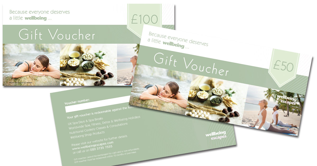
We also created this mini brochure was a way of giving customers a visual inspiration guide that complimented the book in its look and feel. It was a great cost effective give-away at events and helped generate more interest from a wider audience who may not have been on a spa/wellness break.