Craig Lister MISTD Graphic Design
MCSD, Chartered Designer
United Kingdom - East Midlands
| Email address | cxlister@gmail.com |
|---|---|
| Profile description | I’m Craig Lister, a Creative Director and designer with over 20 years of experience helping organisations uncover what makes them different and turning that into brands, campaigns and experiences that people genuinely connect with. For me, great design has never been about decoration. It’s about understanding people, asking better questions and creating work with purpose. Whether I’m shaping a brand from the ground up, leading creative teams or collaborating with clients, I’m driven by ideas that are simple, honest and built to last. I’ve spent my career working across branding, digital, print and campaigns, partnering with everyone from ambitious start-ups to established organisations. What I enjoy most is bringing clarity to complexity… finding the story, the strategy and the visual language that helps businesses move forward with confidence. I’m passionate about the craft of design and the people behind it. I believe the best creative work comes from curiosity, collaboration and a relentless attention to detail. It’s why I continue to champion human creativity, celebrate exceptional design and mentor the next generation of creatives wherever I can. |

Michael Tetlow
Brand Identity & Social Media
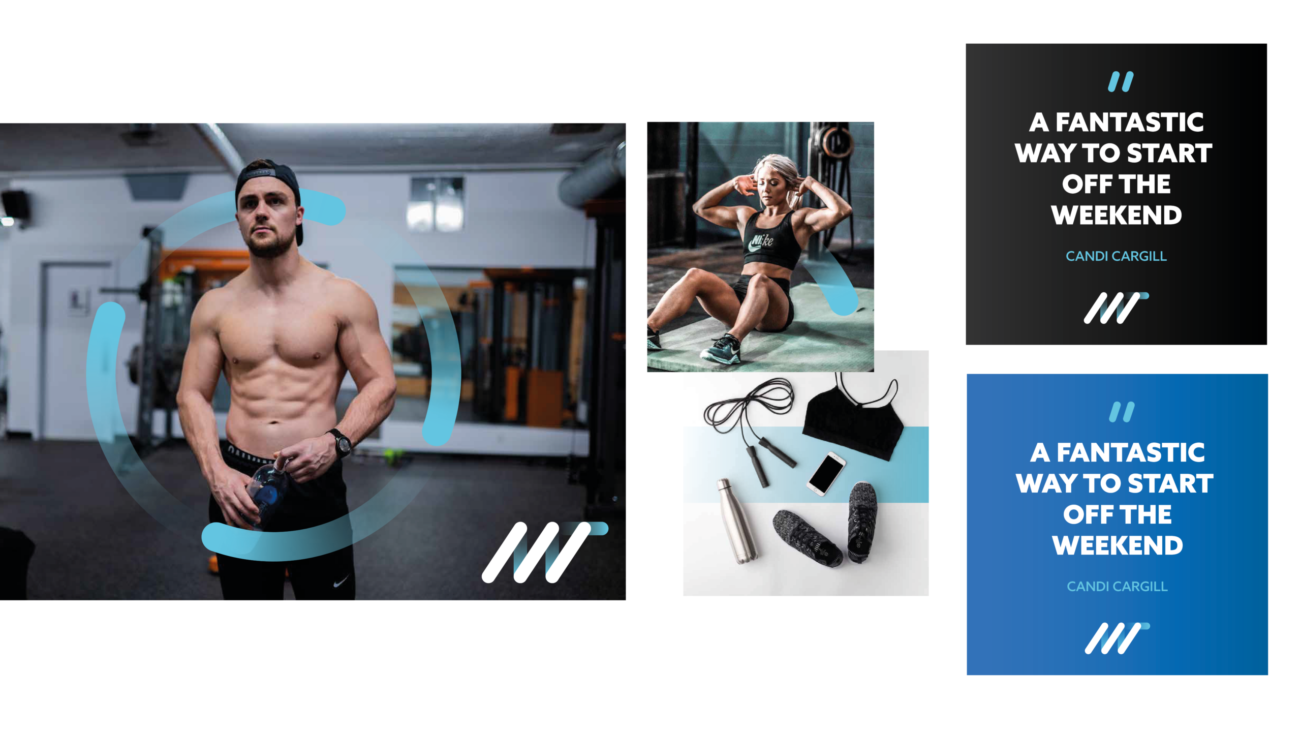
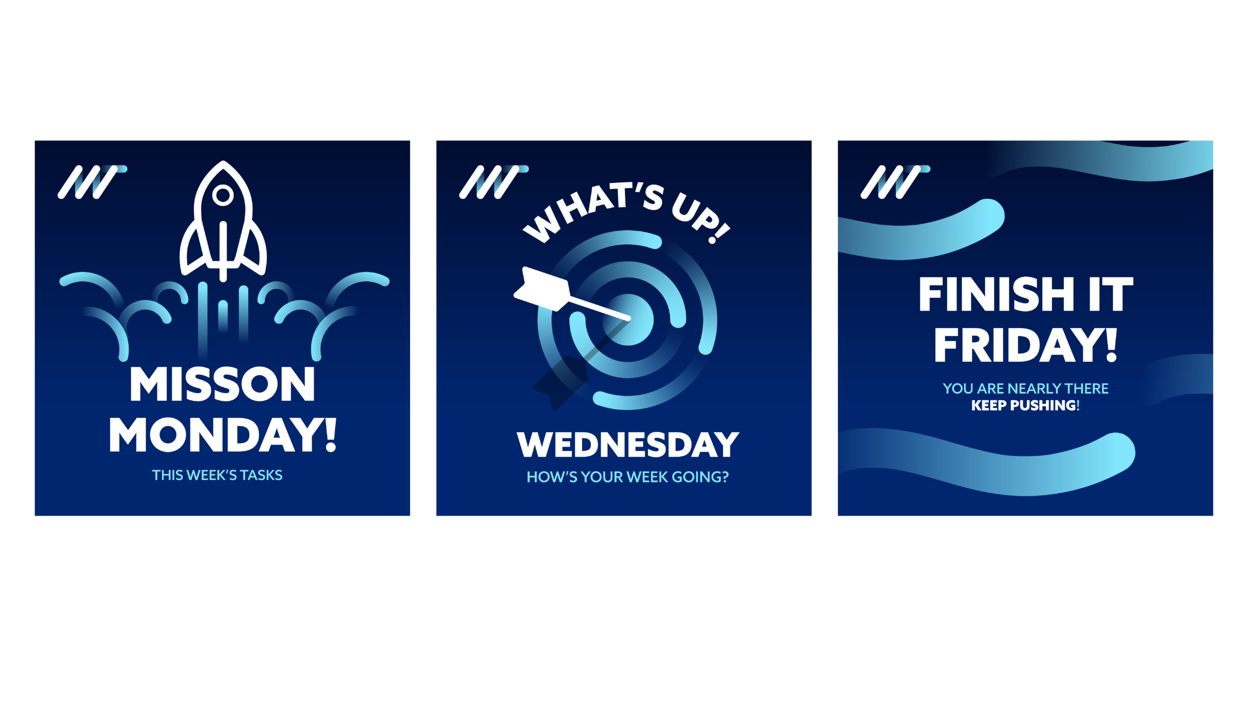
This project involved creating a complete visual identity for personal trainer and fitness coach Michael Tetlow, including logo design, brand development, and a social media system that could grow with his business. The goal was to create a brand that felt energetic and progressive while remaining approachable and accessible to people at every stage of their fitness journey.
The logo is built from a series of directional lines that suggest forward motion, momentum, and continual improvement. These lines connect to form Michael’s initials, MT, creating a mark that is both distinctive and meaningful. The identity was then extended across social media, where the focus was on making fitness feel less intimidating and more engaging. Rather than relying on the overly aggressive visual language often associated with the sector, the content was designed to be confident, playful, and human—helping Michael stand out in a crowded market while encouraging connection, consistency, and long-term motivation.
ELEFONT
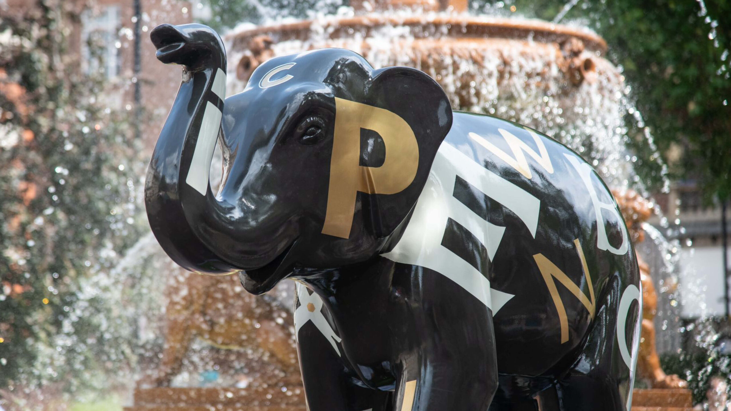
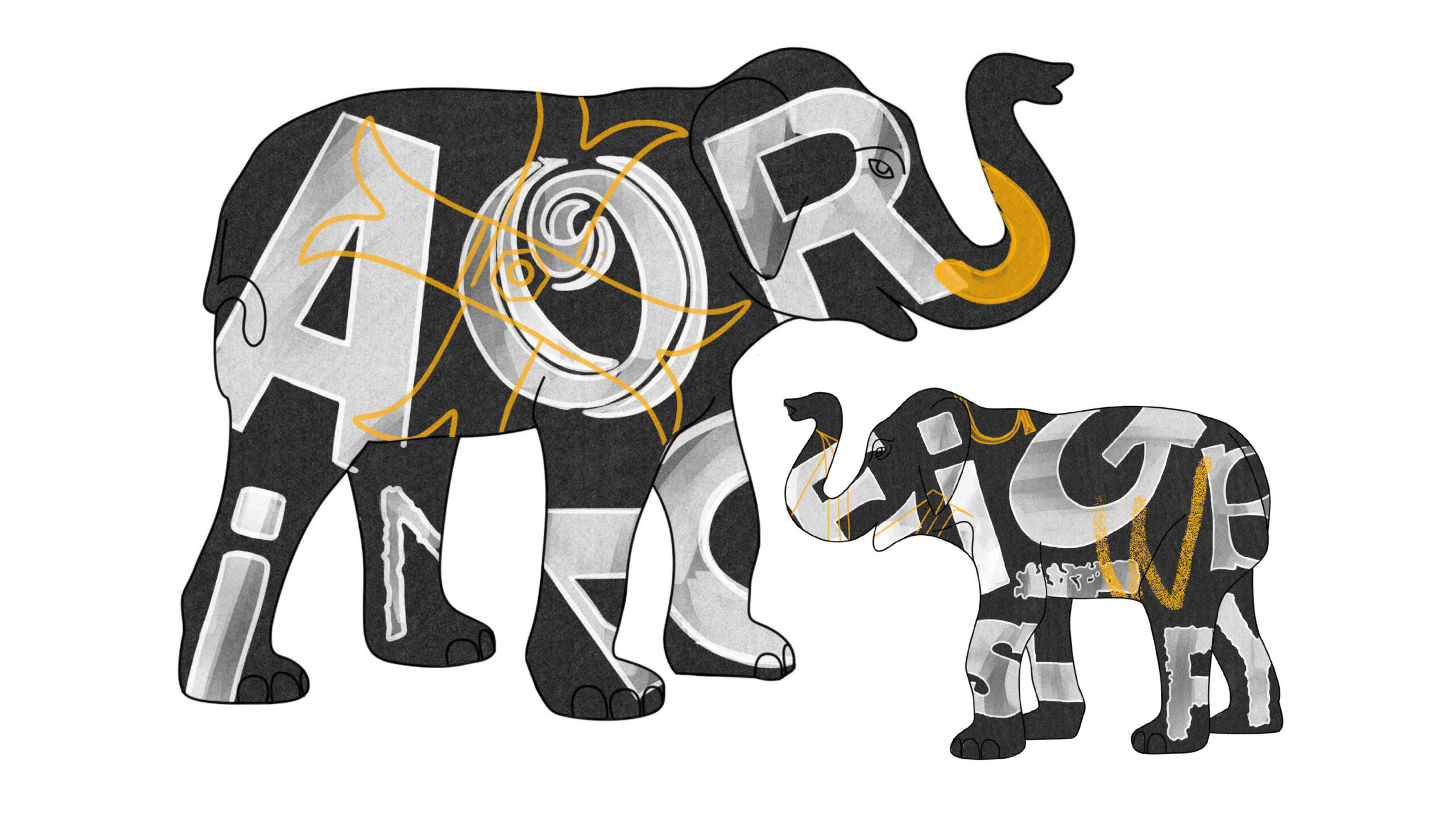
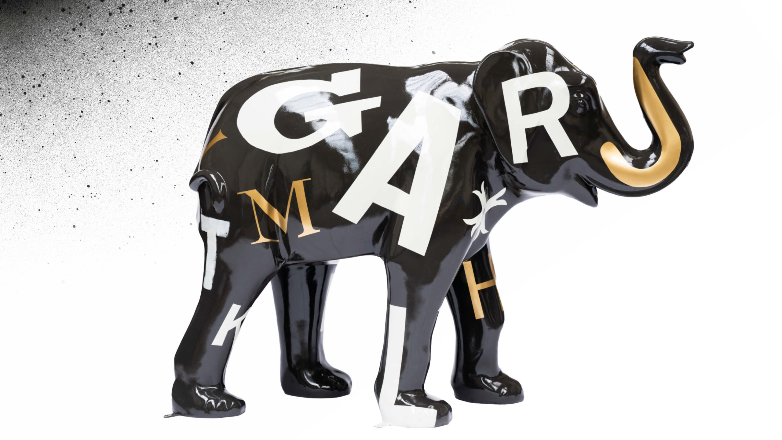
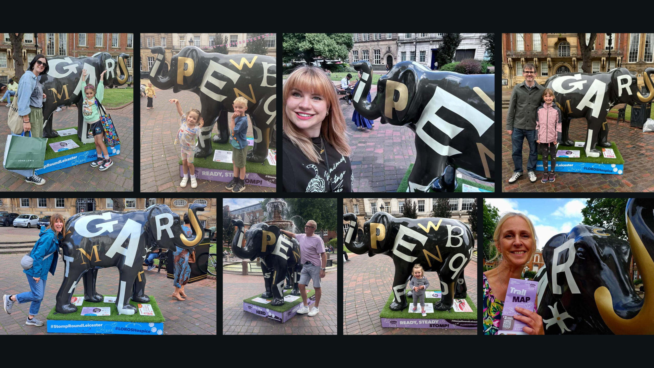
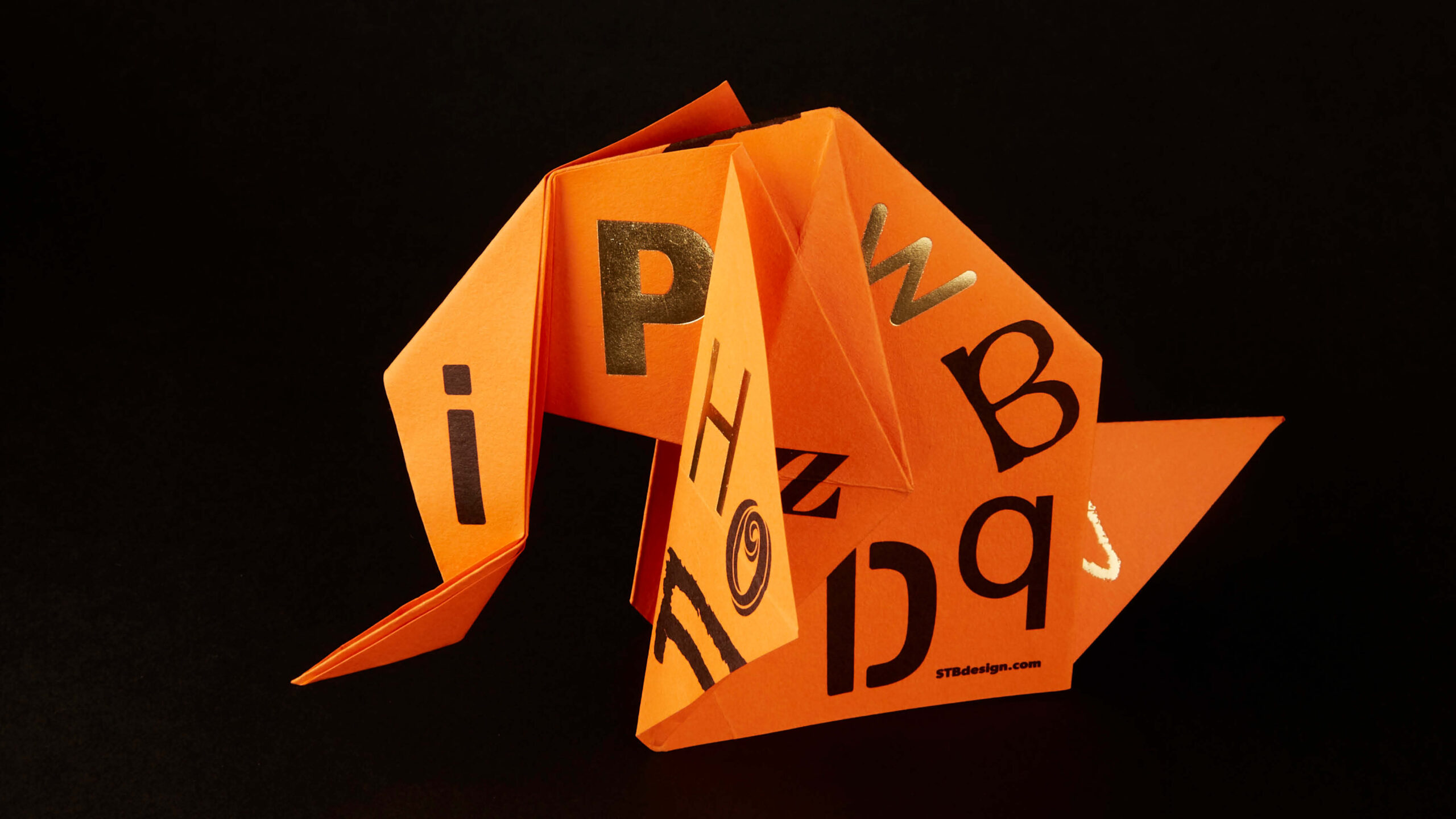
Elefont was commissioned as part of the Elephant Art Trail, a citywide public art initiative by Wild in Art in support of LOROS Hospice. Forty artists were selected to transform large-scale elephant sculptures positioned across Leicester city centre, creating a public-facing cultural trail designed to engage diverse audiences and raise funds for hospice care.
I was lucky enough to be selected as one of those forty artists.
Responsible for the project from initial concept through to final delivery. Given the personal significance of the project and its charitable context, I made the deliberate decision to collaborate with my brother, Adam.
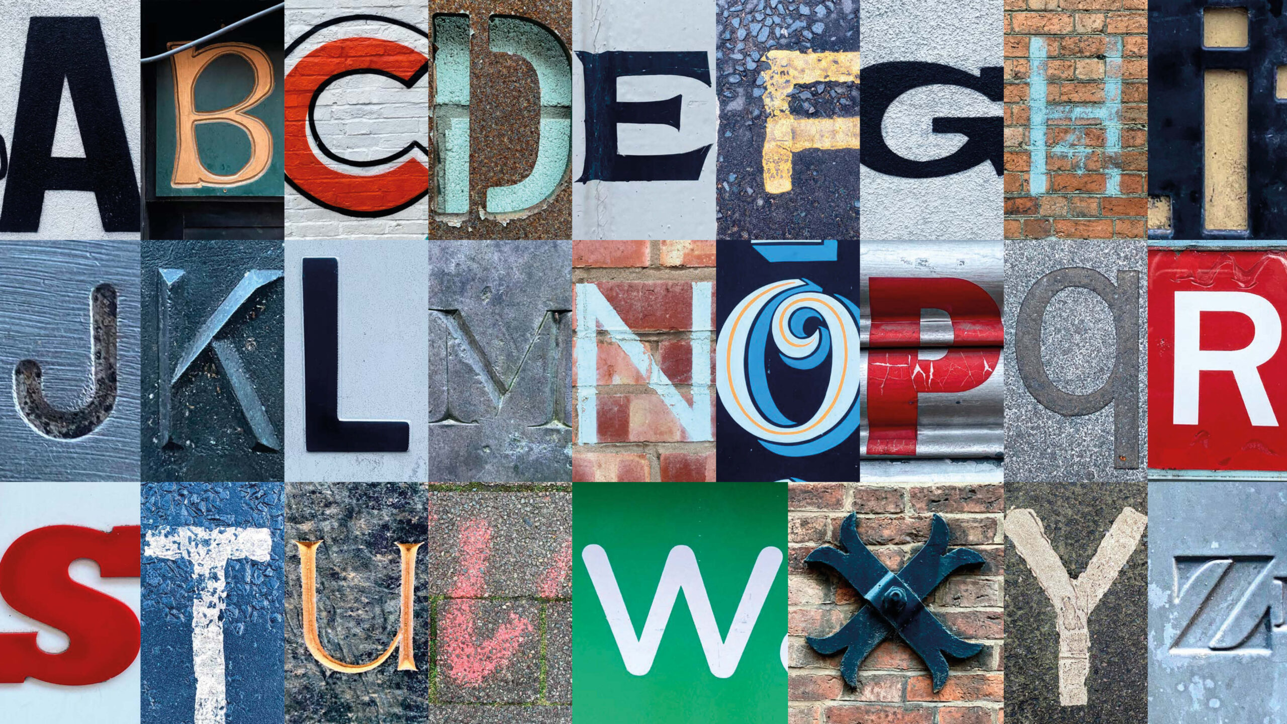
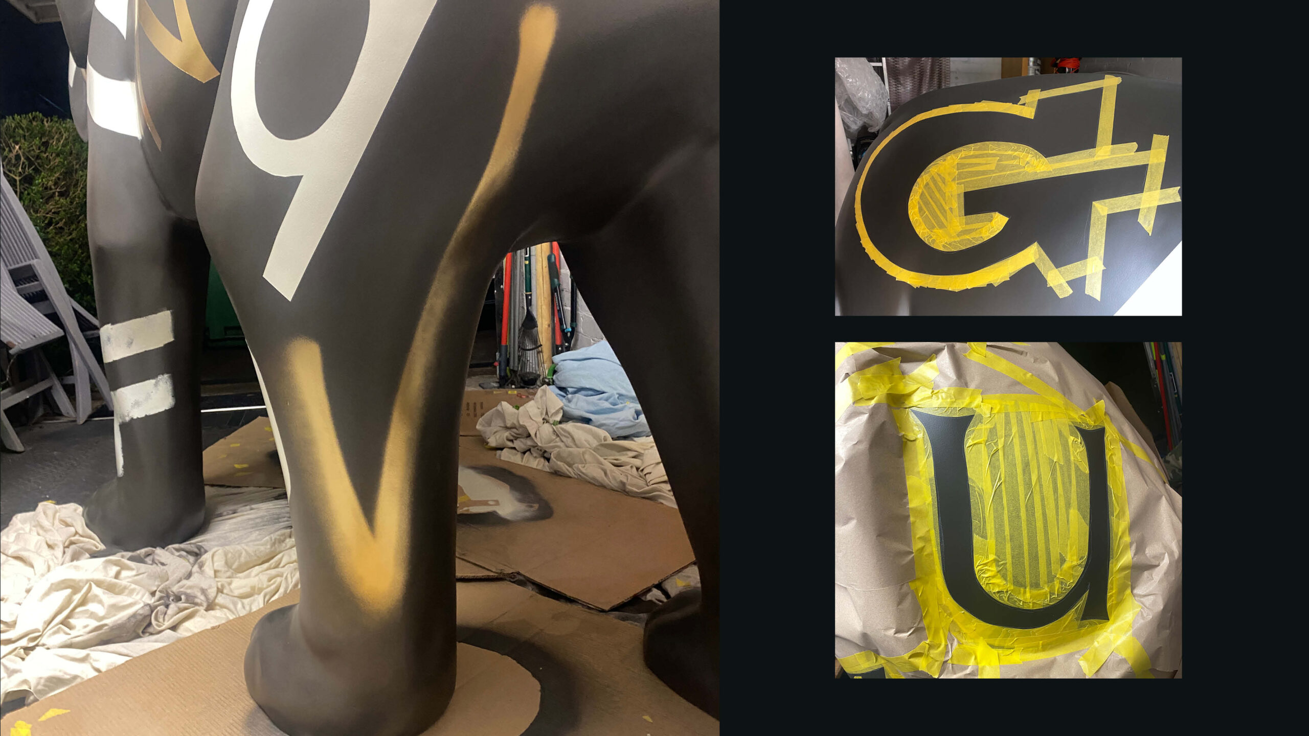
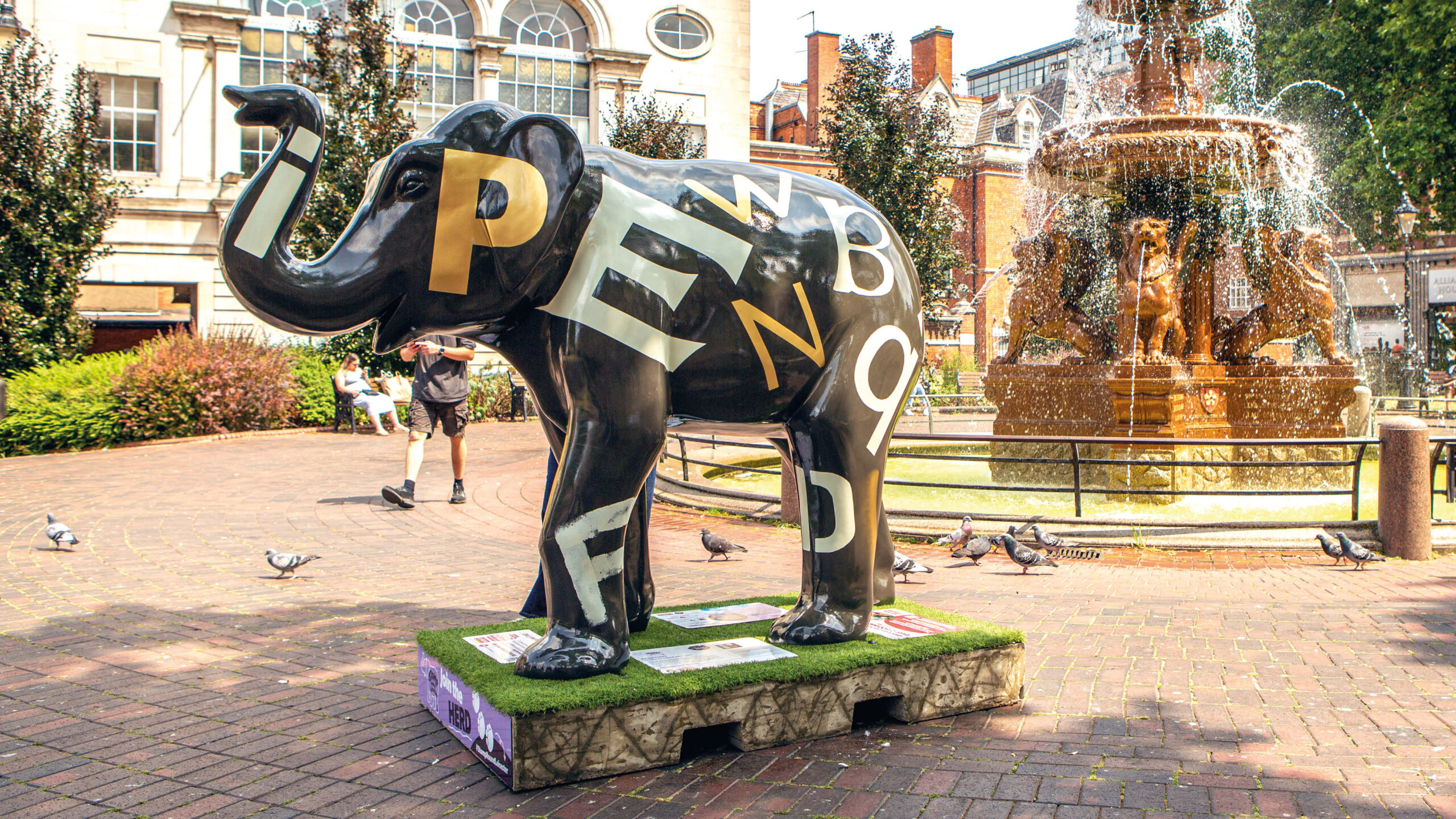
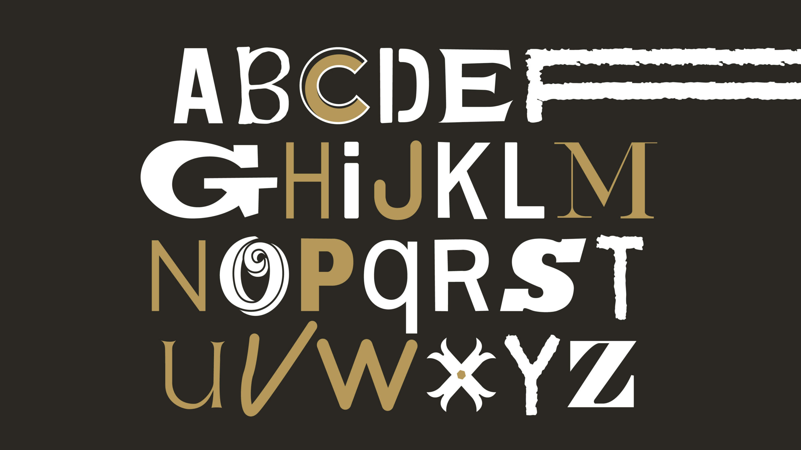
The concept centred on celebrating Leicester’s identity through typography. Drawing inspiration from letter forms found across the city through signage, street markings, architectural details. I developed a typographic system that translated Leicester’s visual language onto the curved surface of the sculpture. Each letter form was treated as a marker of place, culture, and community, balancing historic references with contemporary graphic expression.
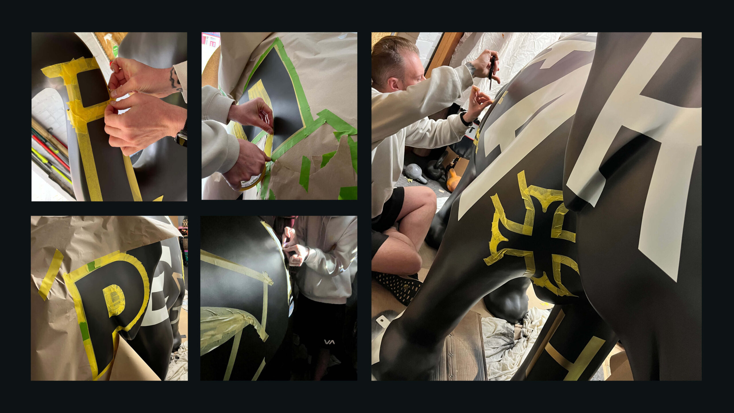
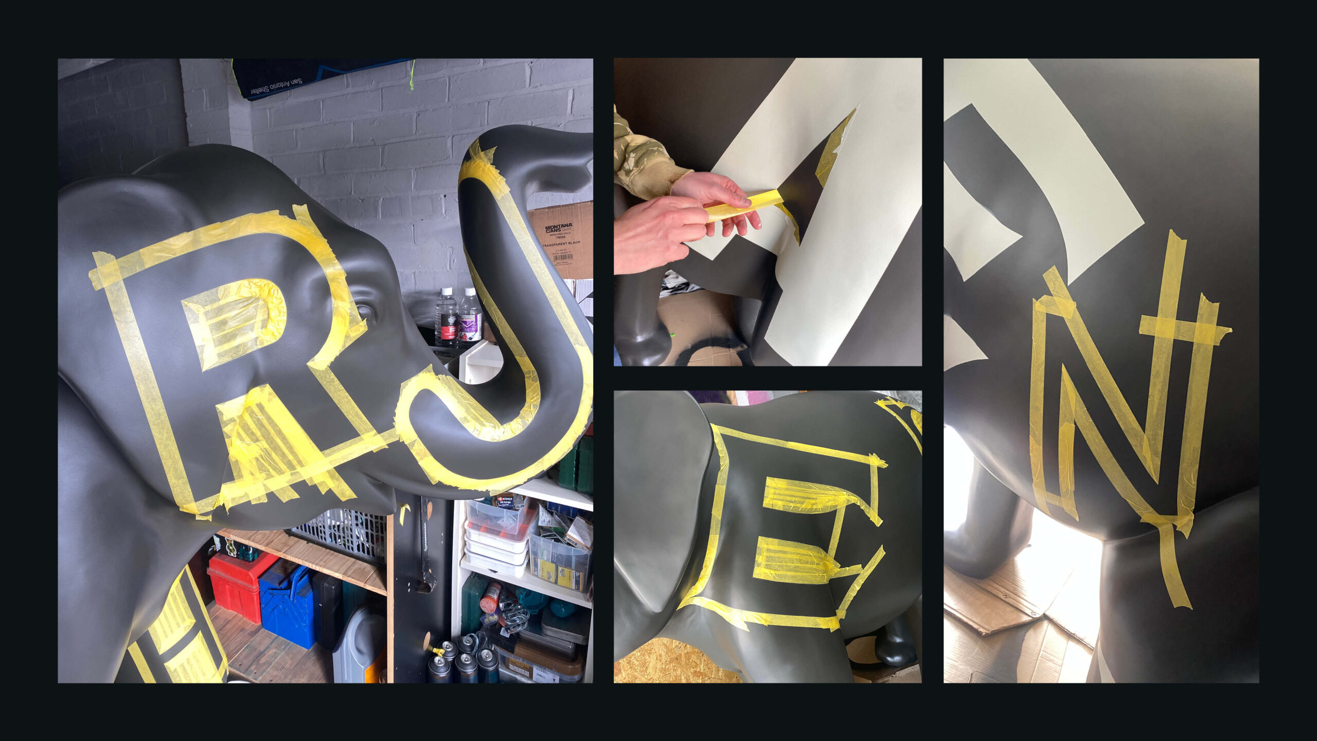
A key challenge was adapting flat typographic forms to a complex three-dimensional surface while maintaining legibility, rhythm, and cohesion across the entire sculpture.
I had to ensure the work was robust, accessible, and visually impactful within a busy public environment, all within a 6 week deadline. The sculpture was installed in Leicester’s Town Hall Square, adjacent to the Golden Lion Fountain, where it needed to sit comfortably alongside historic architecture while remaining engaging and approachable for all audiences.
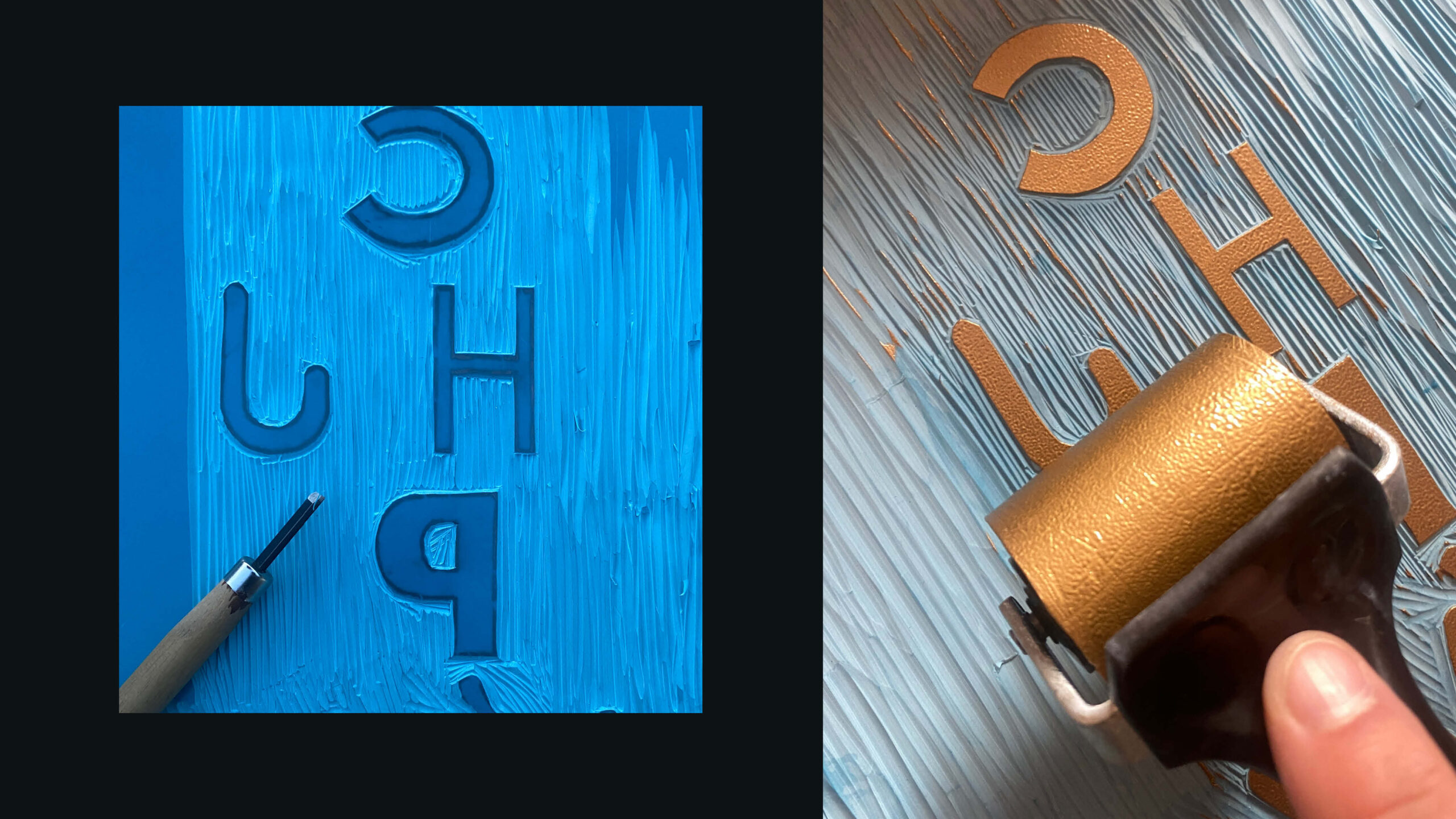
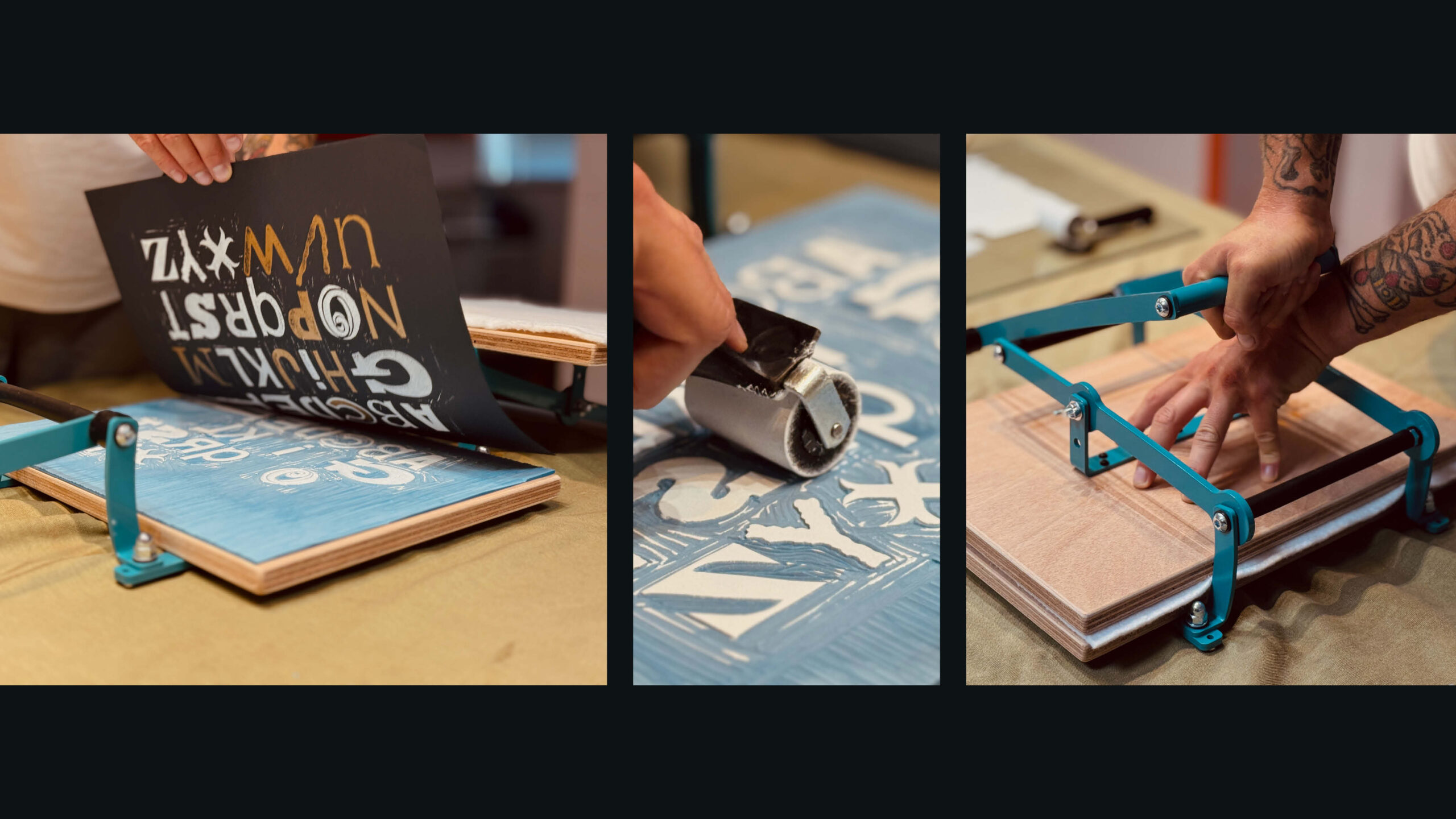
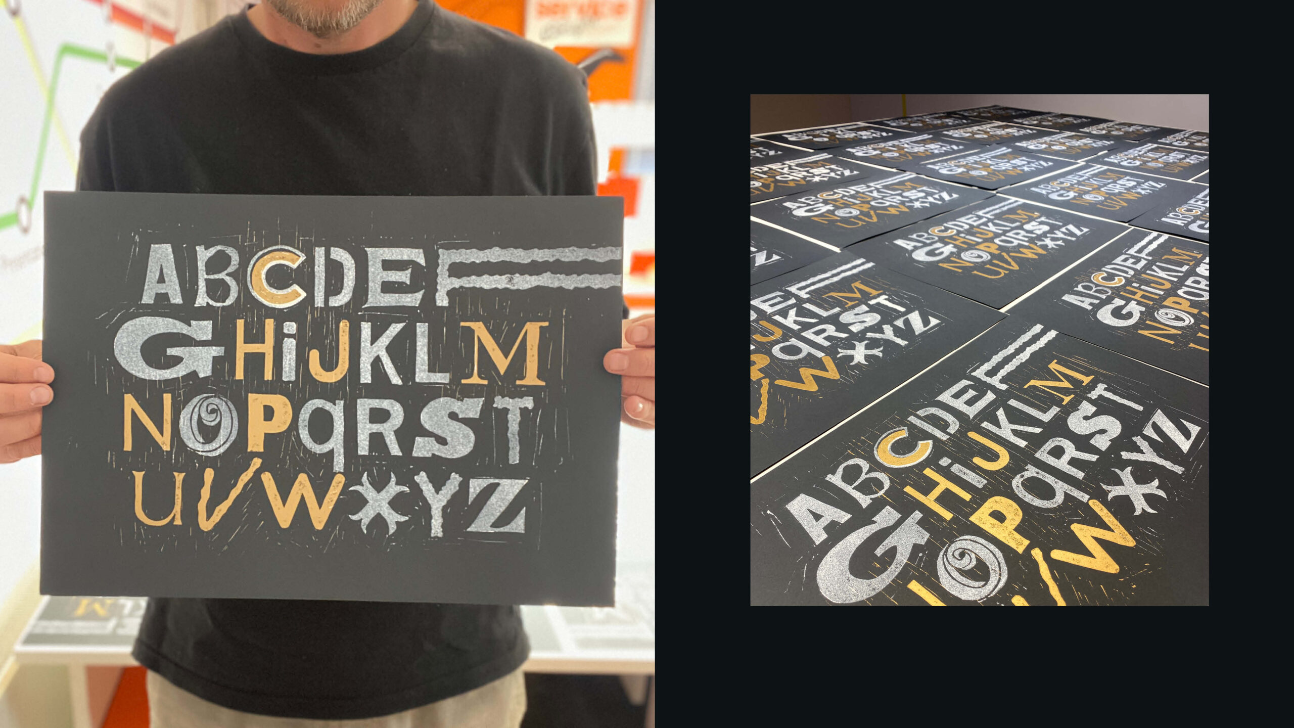
Alongside the main sculpture, I initiated and delivered an additional fundraiser: a hand-produced lino cut print inspired by the Elefont letter forms. The prints were hand-carved and printed onto 140gsm Colorplan, donated by G.F Smith, and offered as a thank-you gift for donations.
Elefont raised £8,245 for LOROS in total.
This total was generated through a combination of:
Artist fee donation £1,000
Public fundraising £3,245
Auction of the sculpture £4,000
I was encouraged by the level of support the project received from the outset, reinforcing my belief in the role design can play in creating positive social impact.
“It has been wonderful working with Craig on LOROS Hospice’s business critical Stomp Round Leicester sculpture trail, which is helping to raise vital funds for the hospice, as well as bring colour and art to our local community. Craig’s creativity, artistic flair and expertise has been such a valuable part of the project, both in his day job as a designer at STB and also as one of our brilliant sculpture artists. But not only is Craig extremely talented, he’s just a generally fantastic person to work with – kind, generous and full of ideas. He’s such an asset to any team and I hope we have the opportunity to work together again post-project!”
Maria O’Malley
LOROS Hospice
Mallory Knox - Album Artwork
Signals Album Artwork
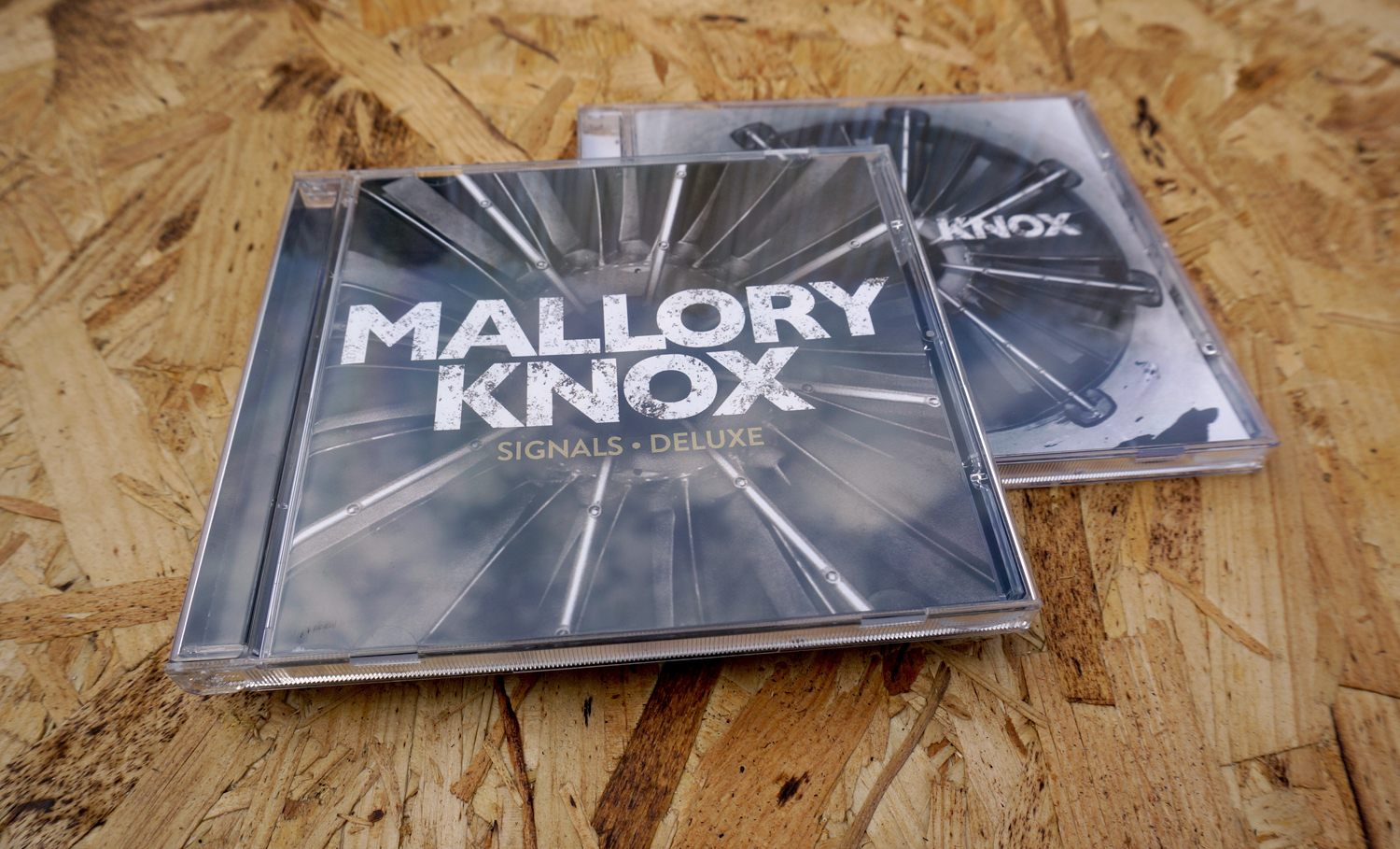
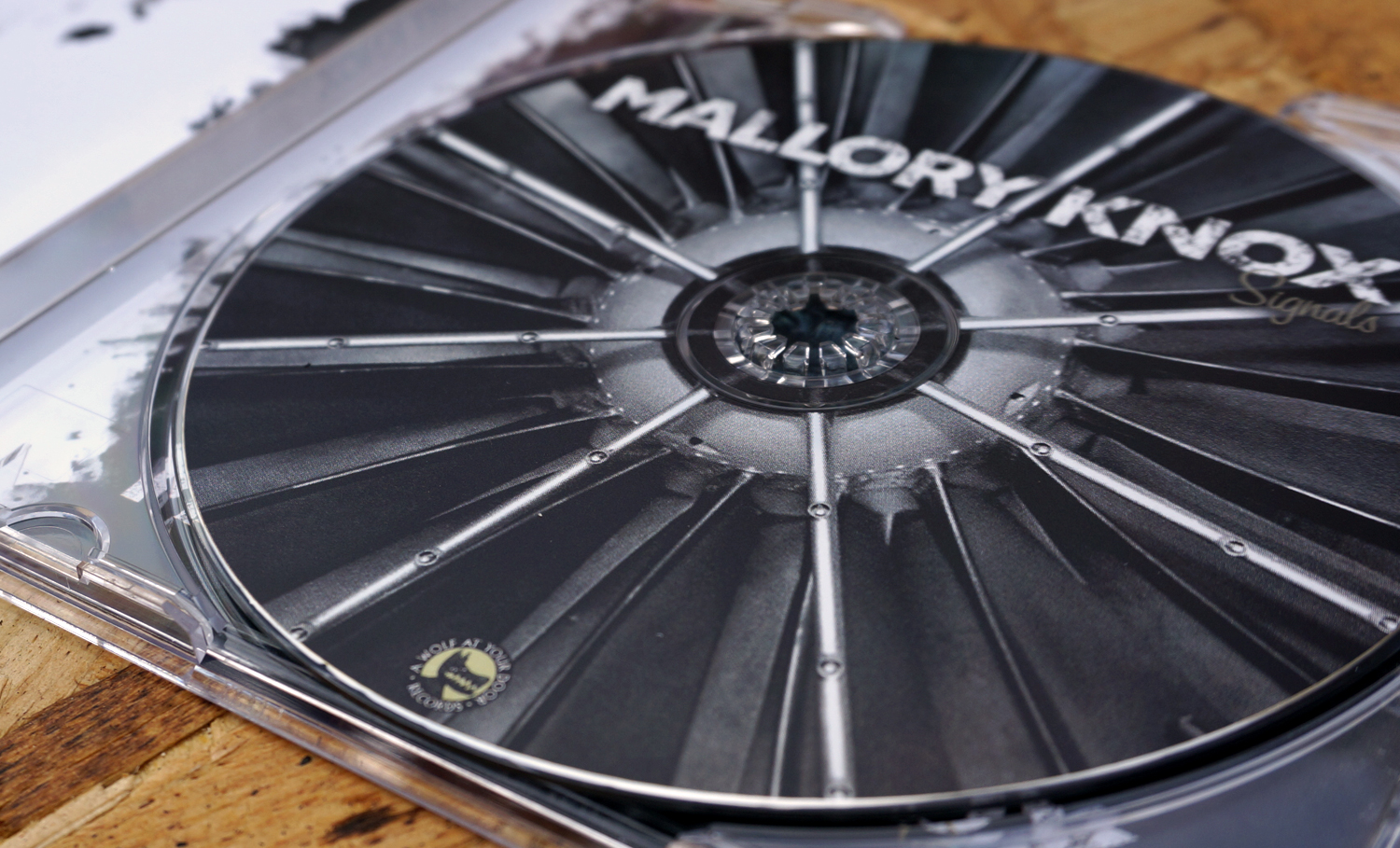
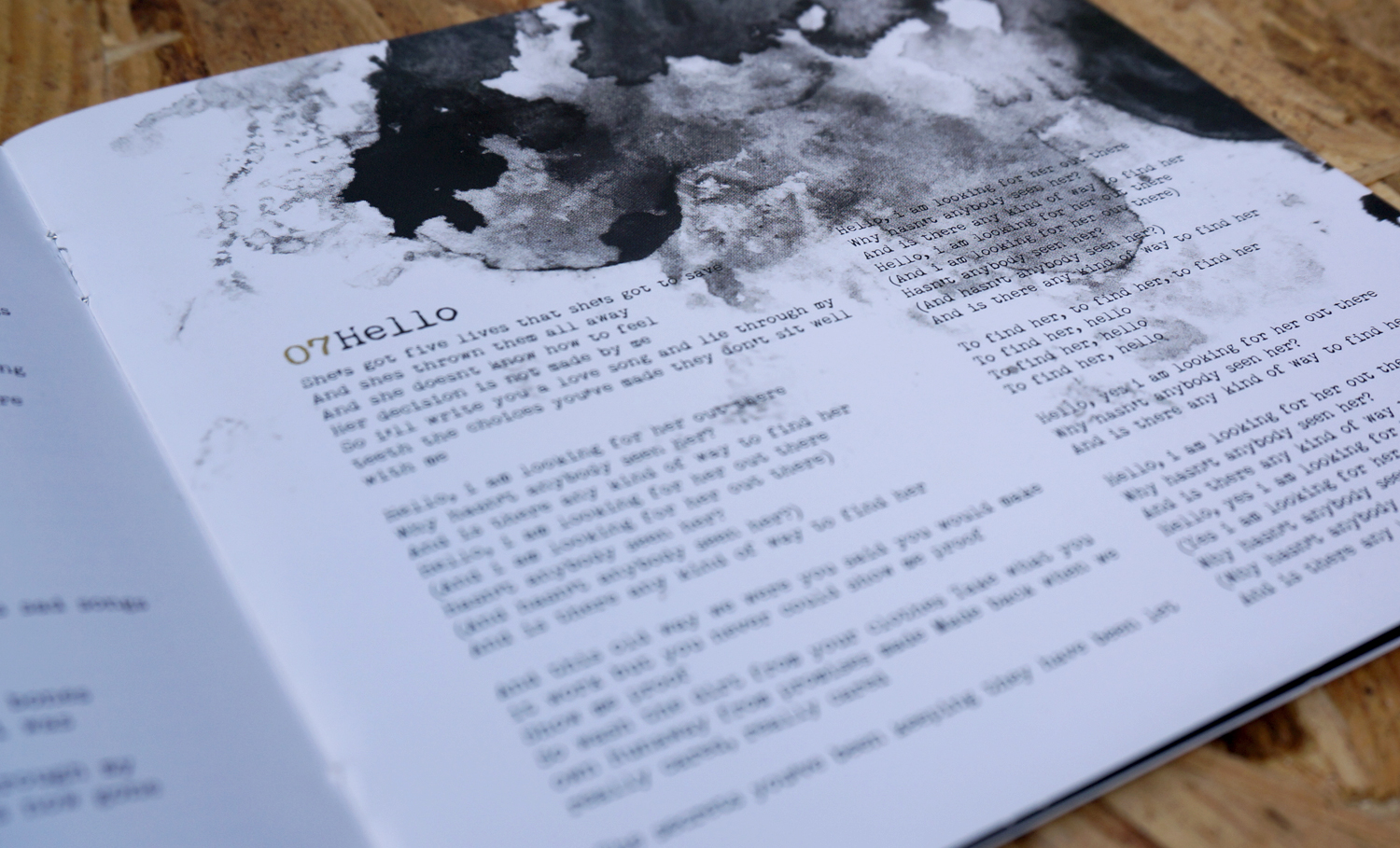
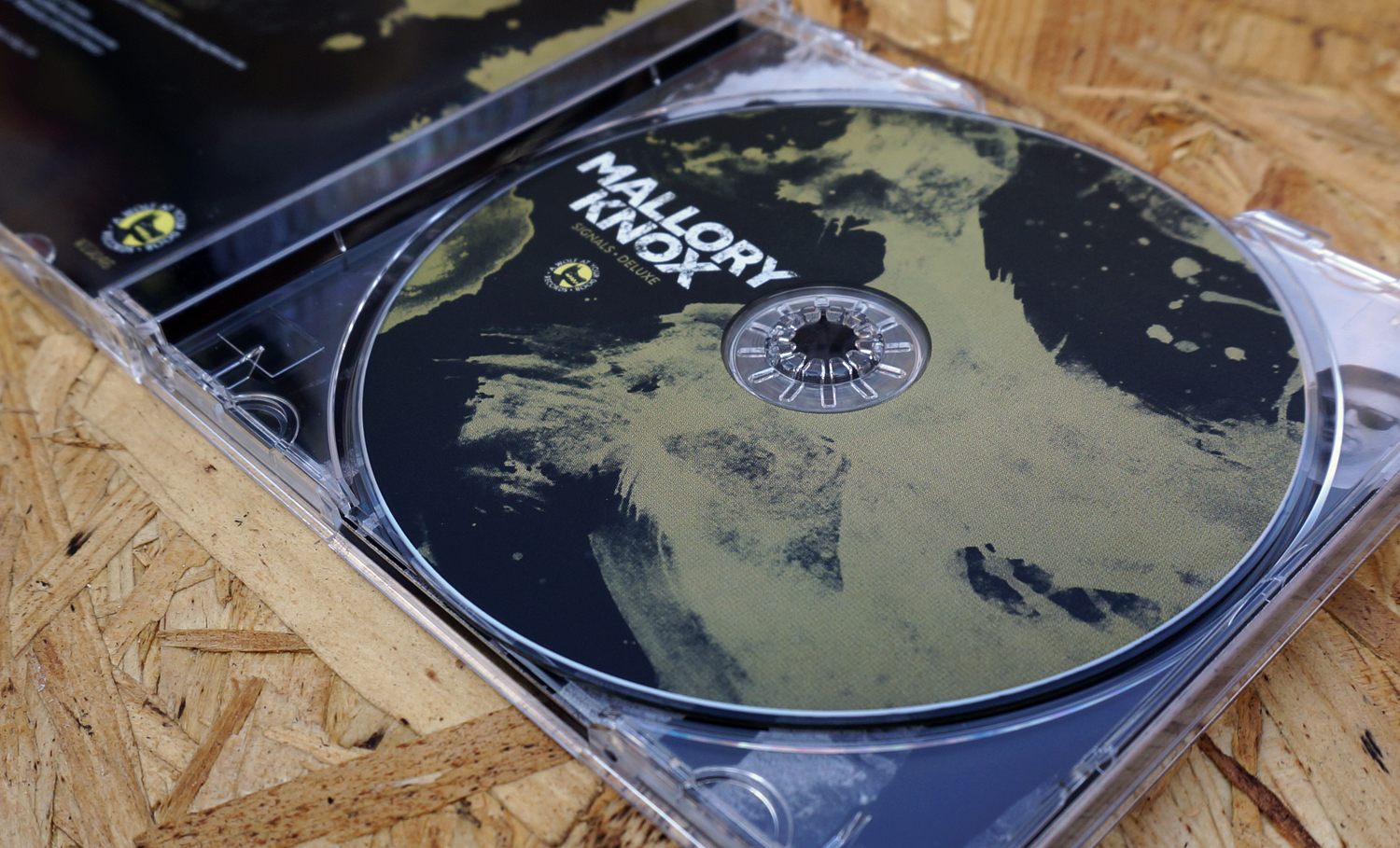
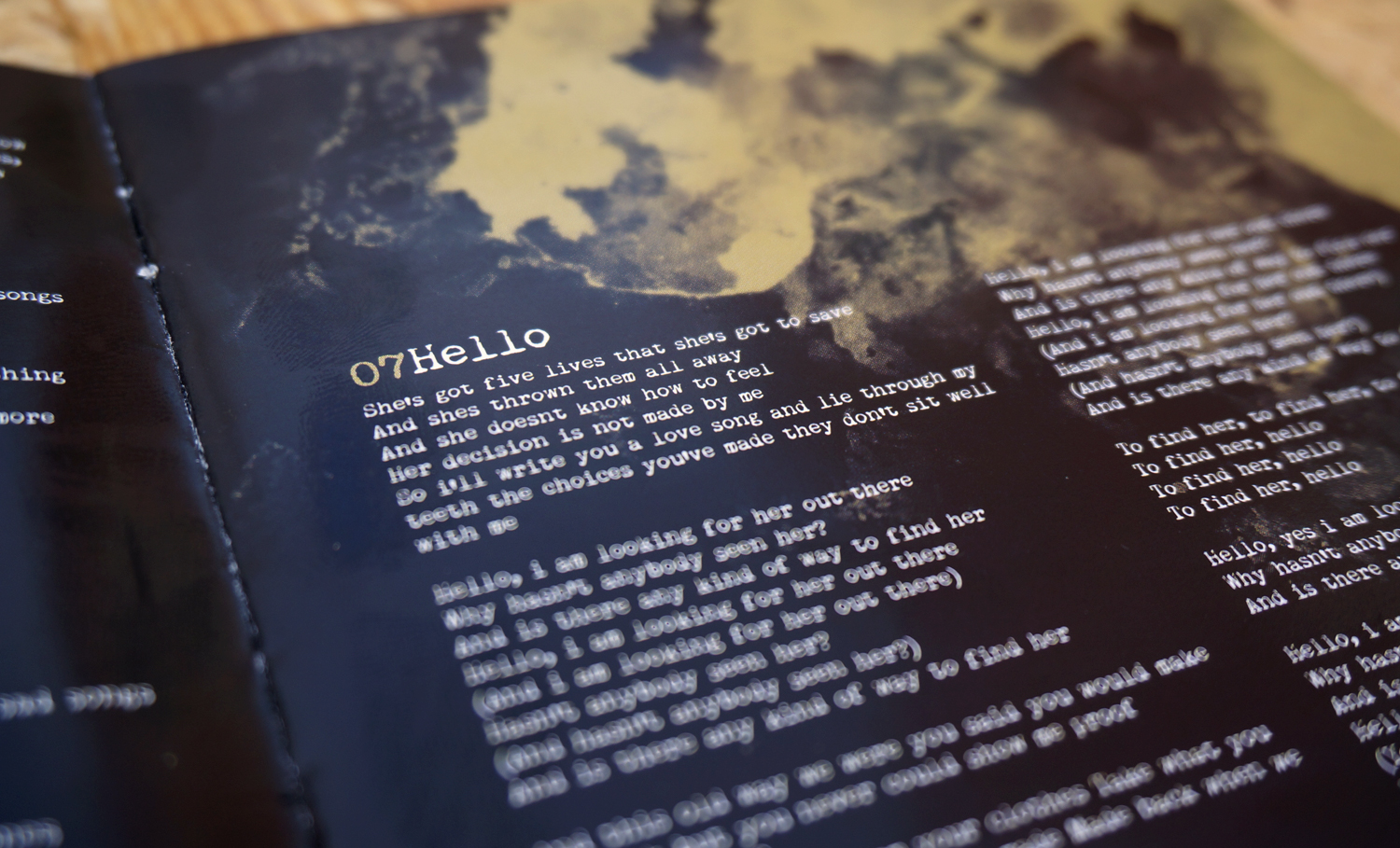
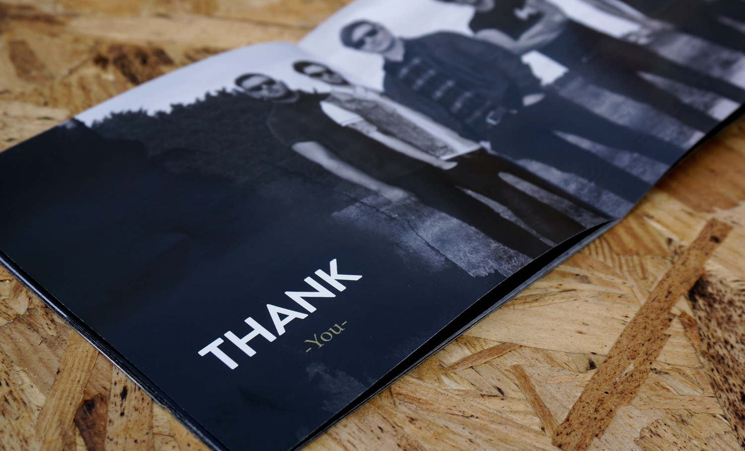
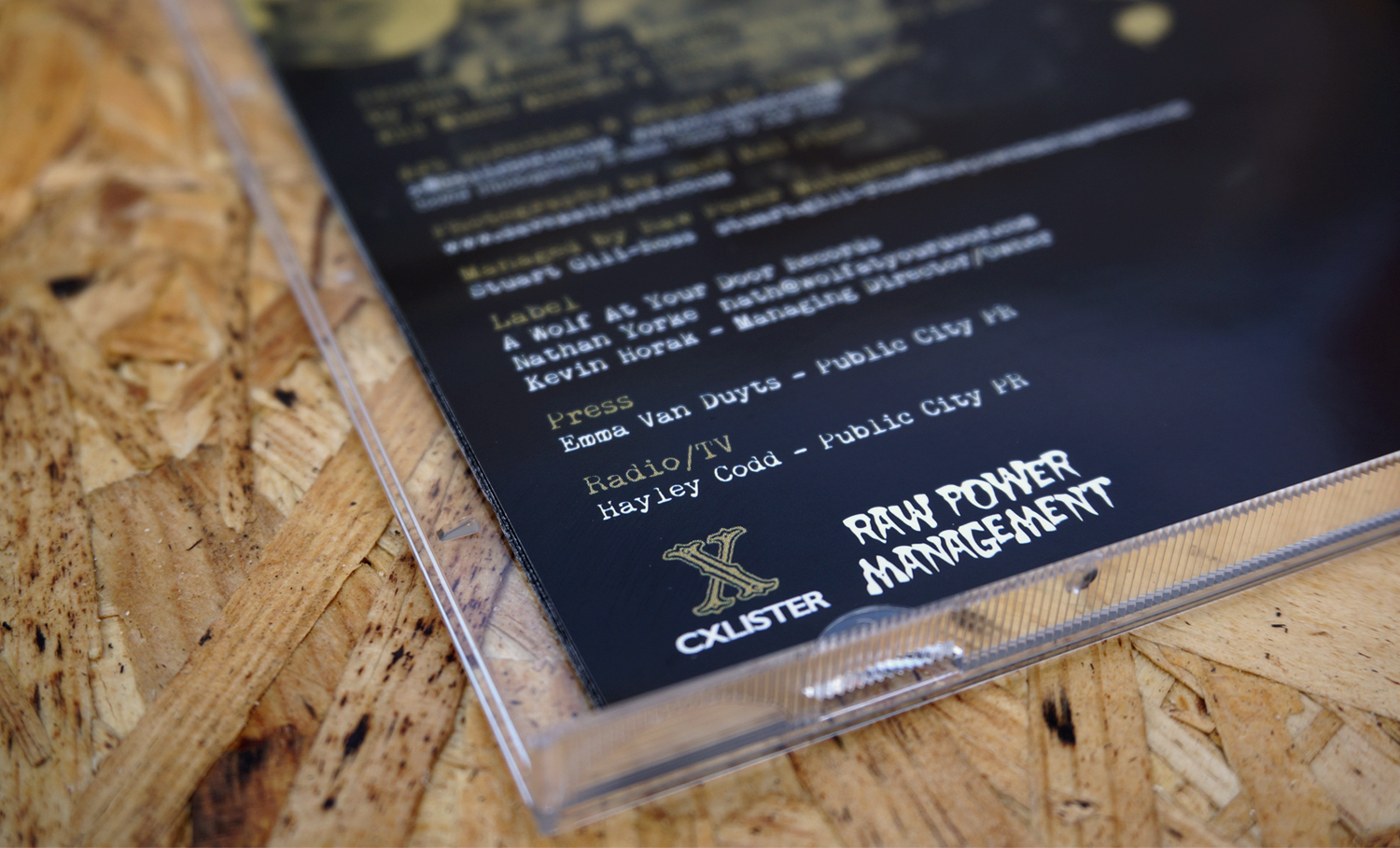
I was commissioned to design the artwork for Signals, the breakthrough album by British alternative rock band Mallory Knox. The project centred on creating a visual identity that reflected the band’s raw, emotionally charged sound—gritty, atmospheric, and full of tension and momentum.
The cover image features a distorted aircraft calibration target, a technical object used to measure optical distortion. I was drawn to the idea that a tool designed to reveal imperfections could become a metaphor for the album itself: themes of pressure, vulnerability, identity, and emotional fracture. The image carries an industrial, almost forensic quality that felt true to the band’s aesthetic while avoiding the more predictable visual clichés often associated with rock and alternative music.
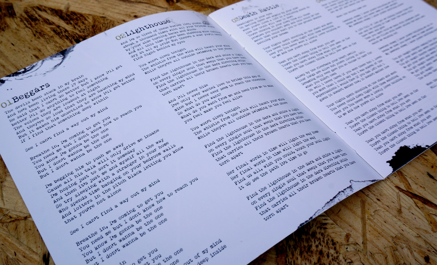
For the typography, I wanted the lyrics and supporting material to feel personal and immediate, as though they had been written rather than designed. A typewriter-inspired typeface introduced a sense of authenticity and intimacy, reinforcing the feeling of letters, journal entries, and private thoughts committed to paper. The contrast between the mechanical precision of the cover image and the imperfect, human quality of the typography created a visual tension that echoed the music throughout the album.
Leicester Grapple Series
Rebrand & Event Identity
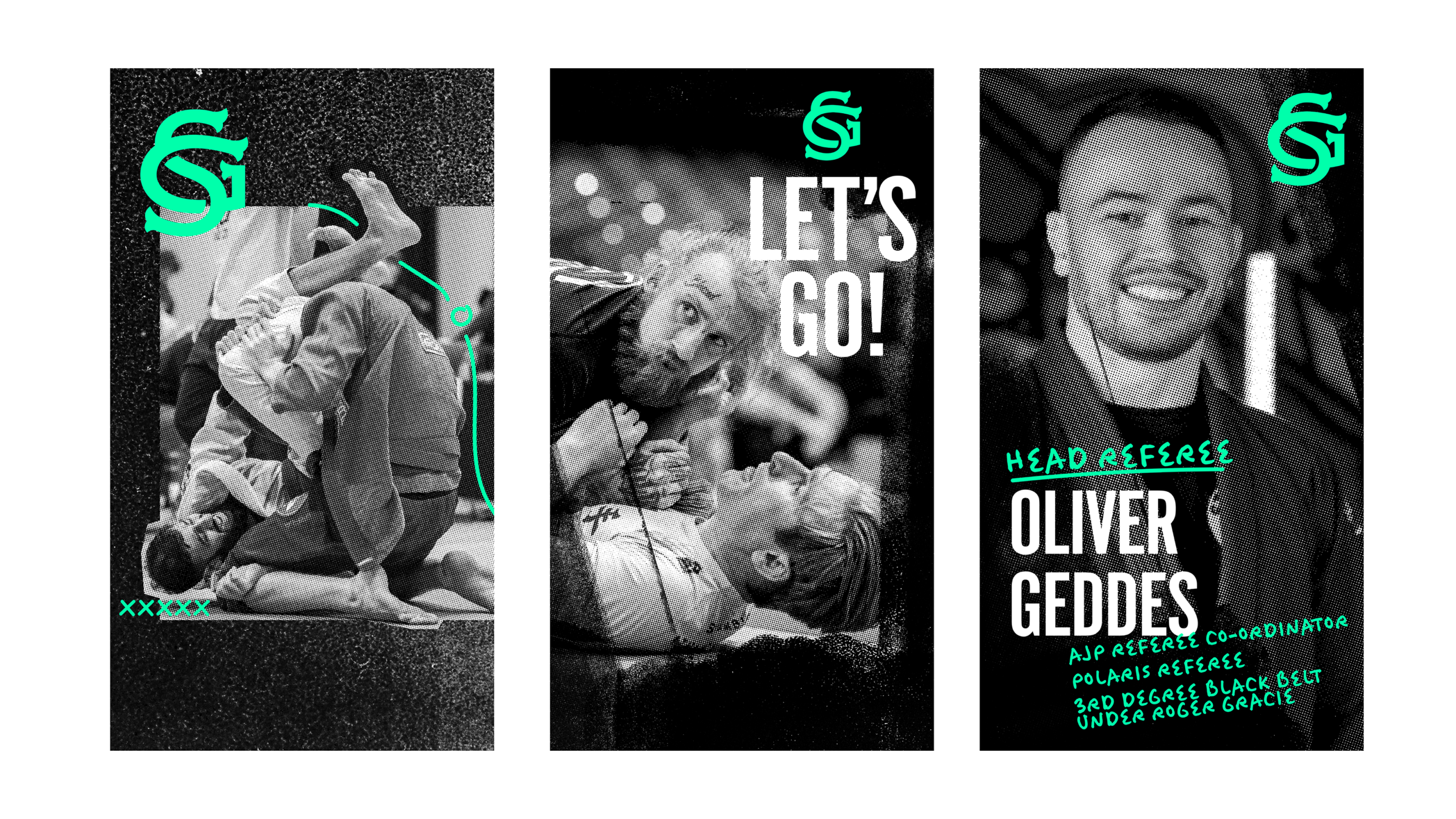
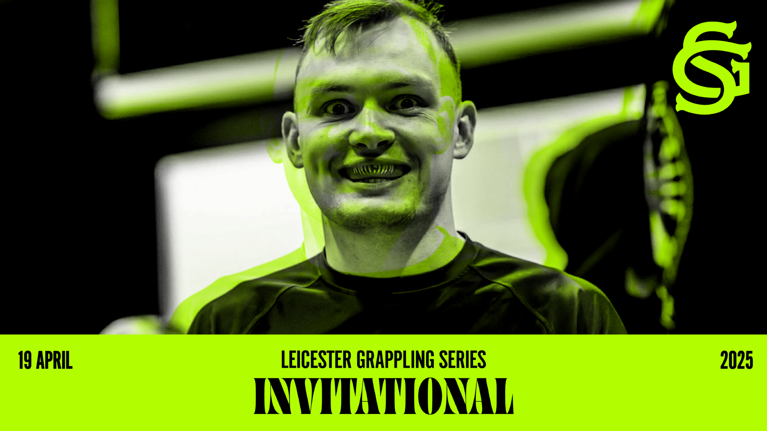
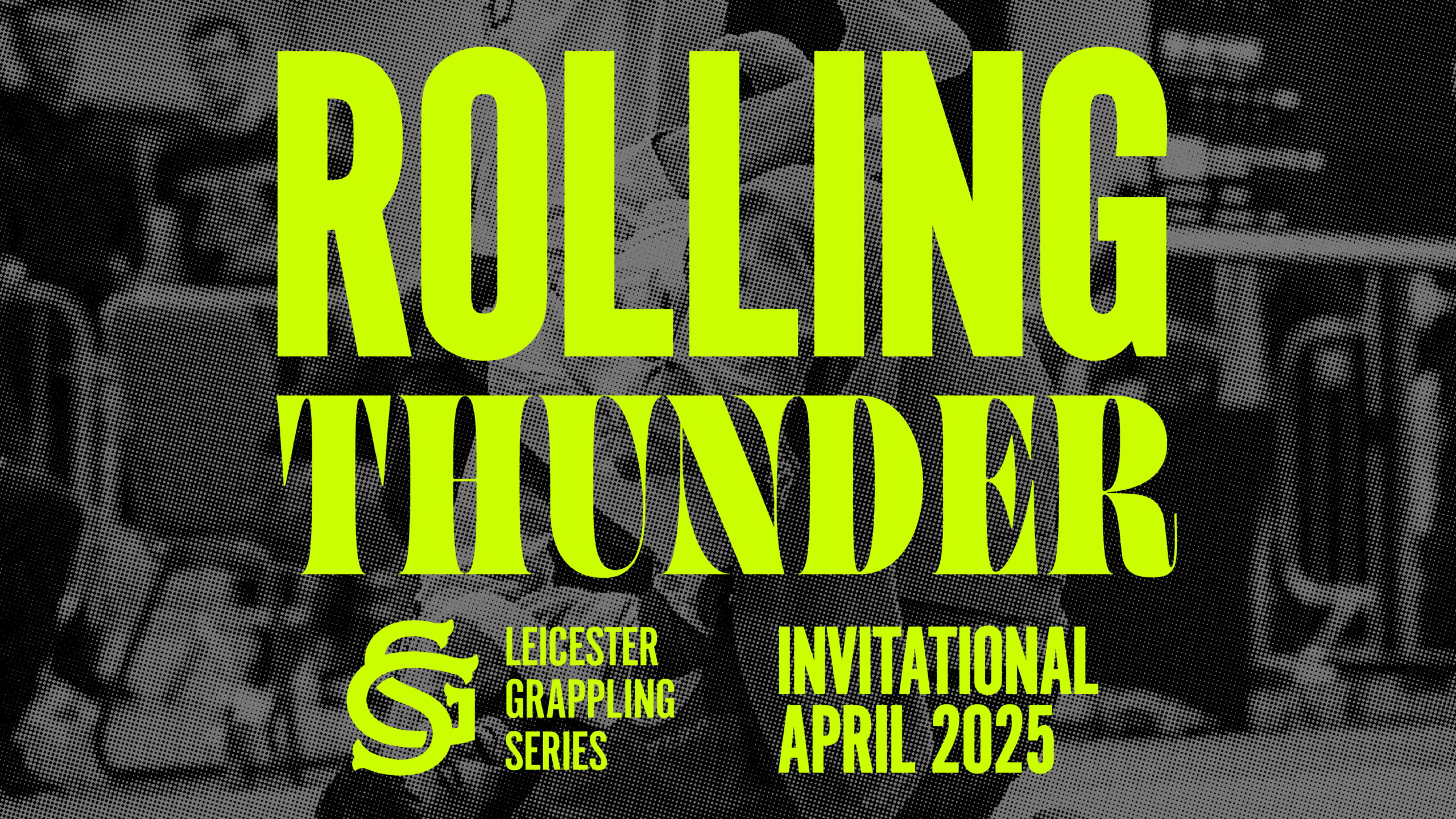
Leicester Grapple Series approached me to reposition the competition as a more established and professional event capable of attracting a wider audience, stronger sponsorship opportunities, and long-term growth. The rebrand was designed not only to elevate the perception of the event, but to create a scalable identity system that could evolve beyond Leicester and support future expansion.
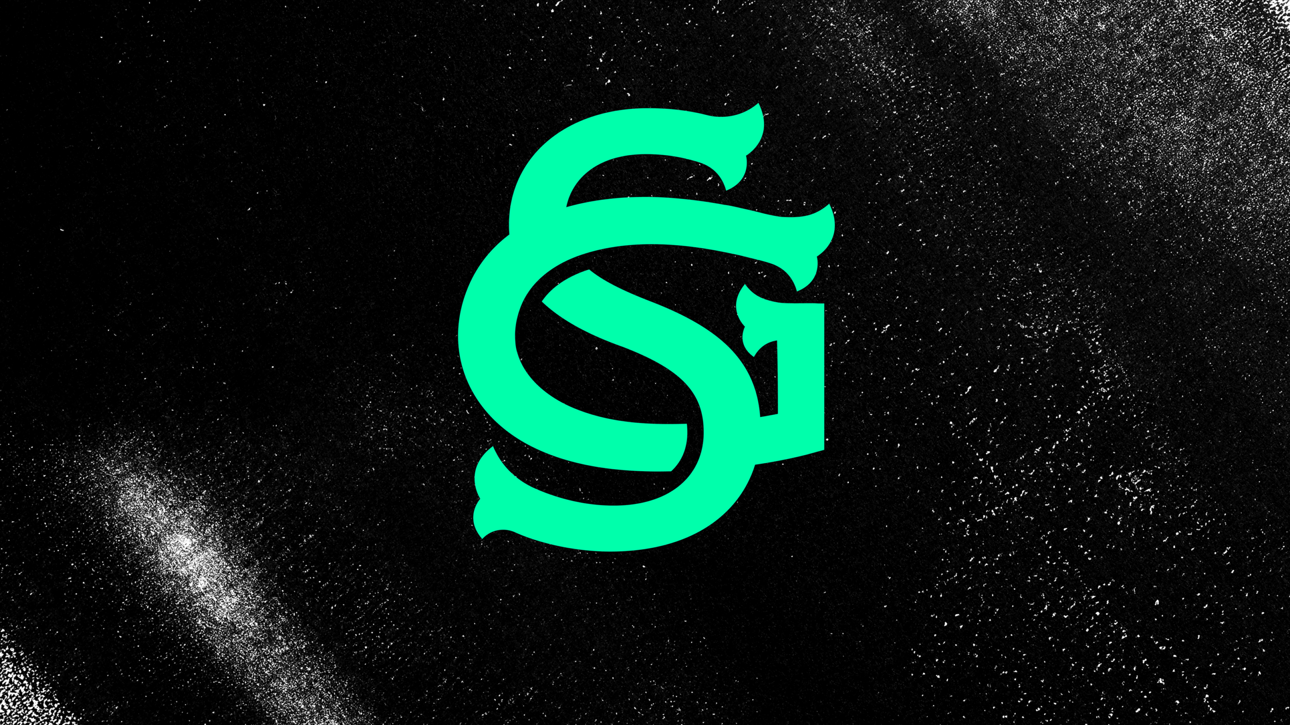
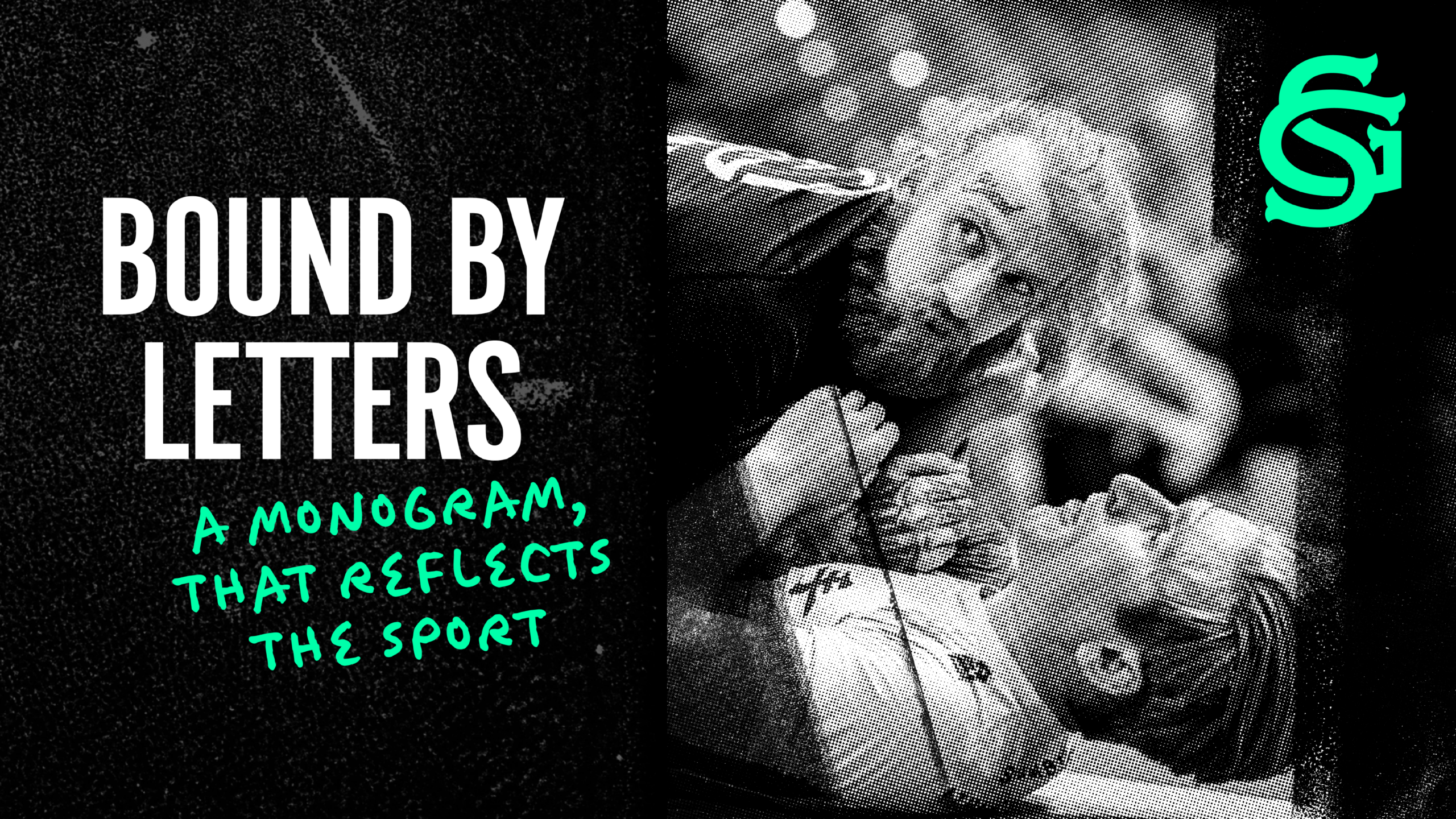
The logo is built from the interaction of two letterforms—the G from Grapple and the S from Series—which interlock to represent the physical connection and movement of grappling itself. The deliberate omission of the L for Leicester was a strategic decision, allowing the brand to remain geographically flexible and capable of being franchised or rolled out in other cities across the UK in the future. The result is a mark that is simple, memorable, and adaptable across a wide range of applications.
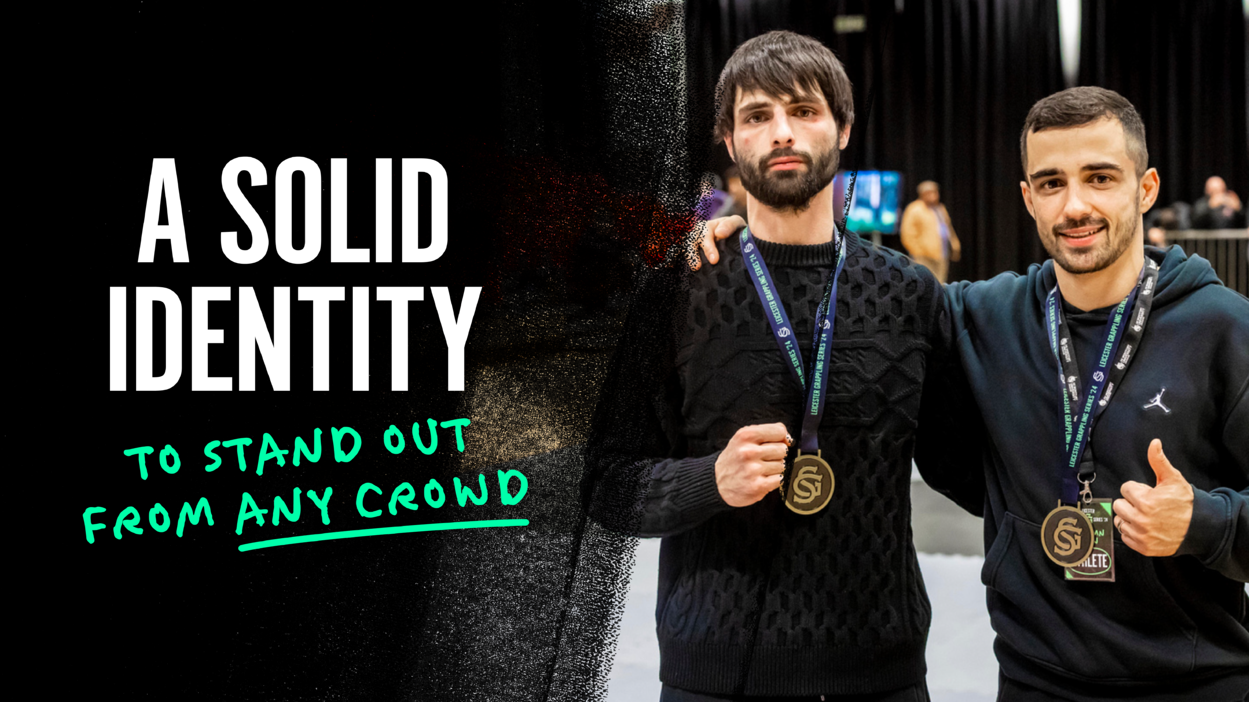
I developed a comprehensive event identity that extended far beyond the logo, creating a cohesive visual system across every touchpoint of the competition. This included event graphics, television screen content, social media assets, merchandise, medals, podium branding, promotional materials, and venue signage. The aim was to deliver a consistent experience for competitors, spectators, sponsors, and online audiences alike—bringing the visual standards of the event closer to those of established national and international combat sports organisations. The rebrand transformed Leicester Grapple Series from a local competition into a brand with the presence, credibility, and flexibility to support future growth.
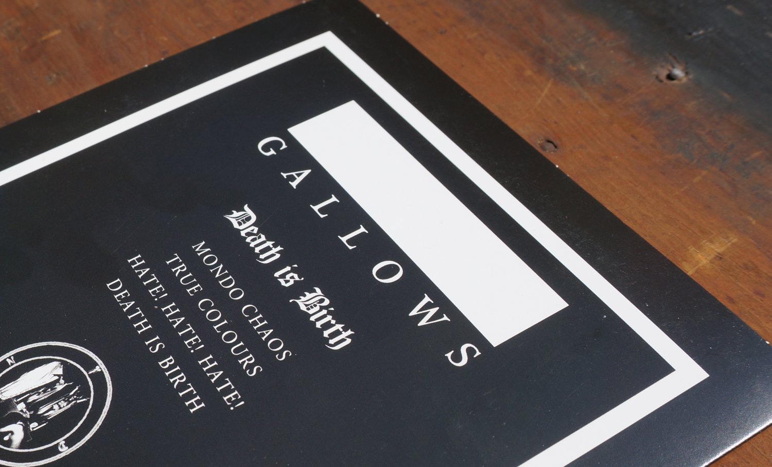
Gallows
One of the highlights of my career as a young designer was getting the chance to work with my favourite band of all time: Gallows.
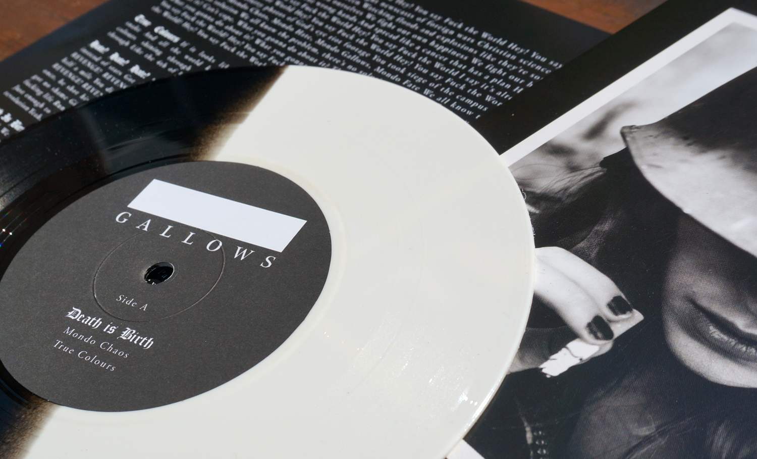
I was asked to design the logo for this era of the band, and I don’t think the thinking behind it has ever really been documented.
The solid rectangle was not just a graphic device, it represented covering up the old logo and starting again. It symbolised a new chapter, acknowledging the past while making room for what came next.
I’ll always be a huge fan of the Frank Carter era, that soundtrack was a massive part of my life. But I also loved what Wade brought to the band. Different sound, different energy, but still unmistakably Gallows.
It is still surreal to look back and realise that, as a young designer, I got to leave a small mark on the band that meant so much to me.